Studio
Services
Approach
Contact
Read Only is an independent design studio collaborating with curious, ahead-of-the-curve, and downright kind people.
Led by creative director and designer, Amber Ladd, we’re a full-service branding studio nestled along the coast of Melbourne, Australia. Working globally, we exist to cut through the familiar with wholly authentic identities that communicate uniquely, connect profoundly, and challenge norms continually—now and later. No future overwrites necessary.
We’re soft-spoken in nature, but our work speaks for itself. We cover needs across the board, from day-one groundwork to reach-for-the stars ideas. At any stage, we work with kindness, a bit of fun, and a gentle-nudge kind of guidance that helps give brands leg-room to make growth and influence possible. All of our projects begin with a strategic foundation, with the capacity to fold into more.
Brand Strategy
Verbal Identity
Visual Identity
Art Direction
Illustration
Copywriting
Packaging
Book & Publication Design
Print Materials
Signage & Wayfinding
Web Design & Development
App Design
Creative Consulting
We approach each project with a sense of playful curiosity—guided by intuition, grounded in strategy. It’s in our DNA to always be exploring, questioning, challenging, learning and sharing—its what keeps our work interesting. We’re constantly seeking new ways of creating and doing things, with an insatiability that means we’re always moving forward.
We place authenticity above all else and work to form a deep understanding of our clients and their vision to achieve it. We encourage them to be true to who they are and withstand the downward pull of passing trends with an innovator’s mindset. Whether we’re crafting an identity from scratch or reshaping an existing one, we work methodically to find what’s true before bringing it to life.
If you’d like to discuss a project or learn more about our work, we’d love to hear from you—it would make our day.
General / Press:
hi@readonly.work
New Enquiries:
Form ↗
1
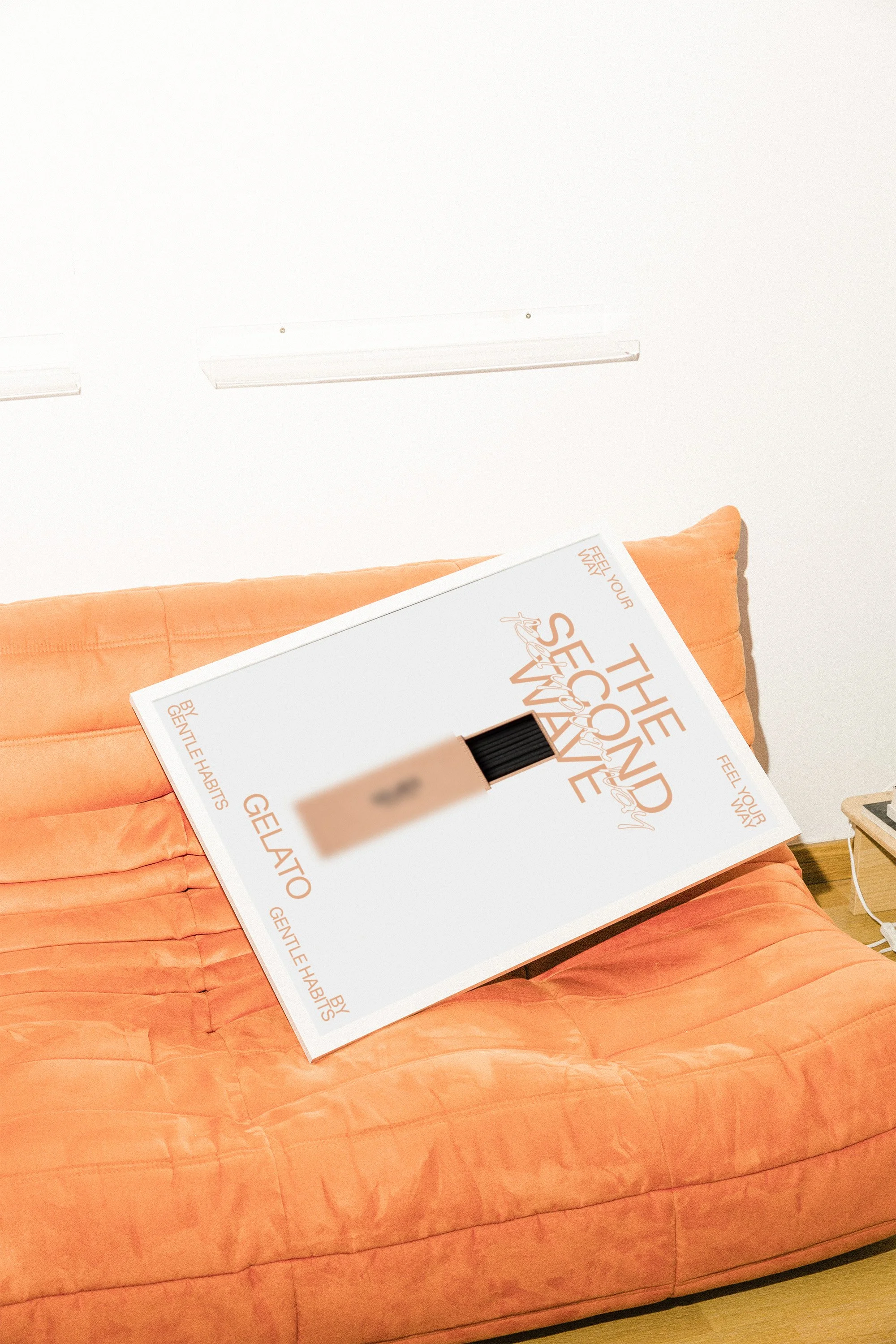
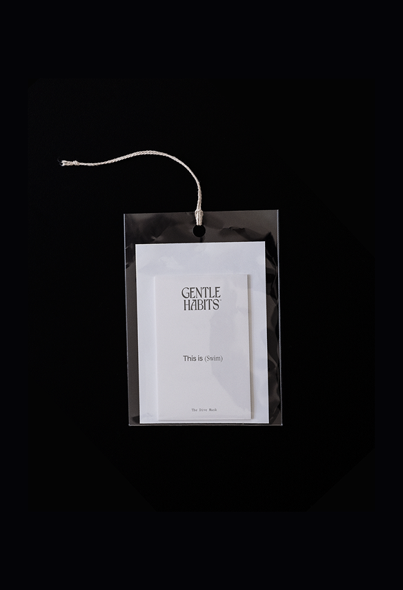
Gentle Habits
Lifestyle, Consumer Goods
Art Direction, Identity, Campaign, Print
2022
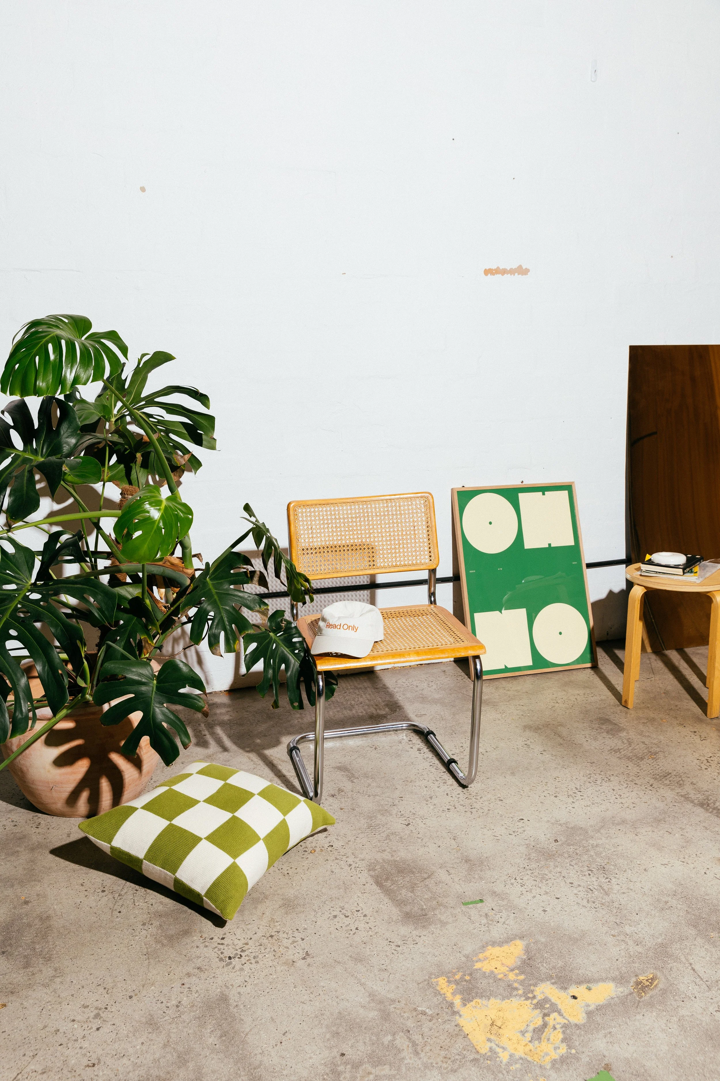
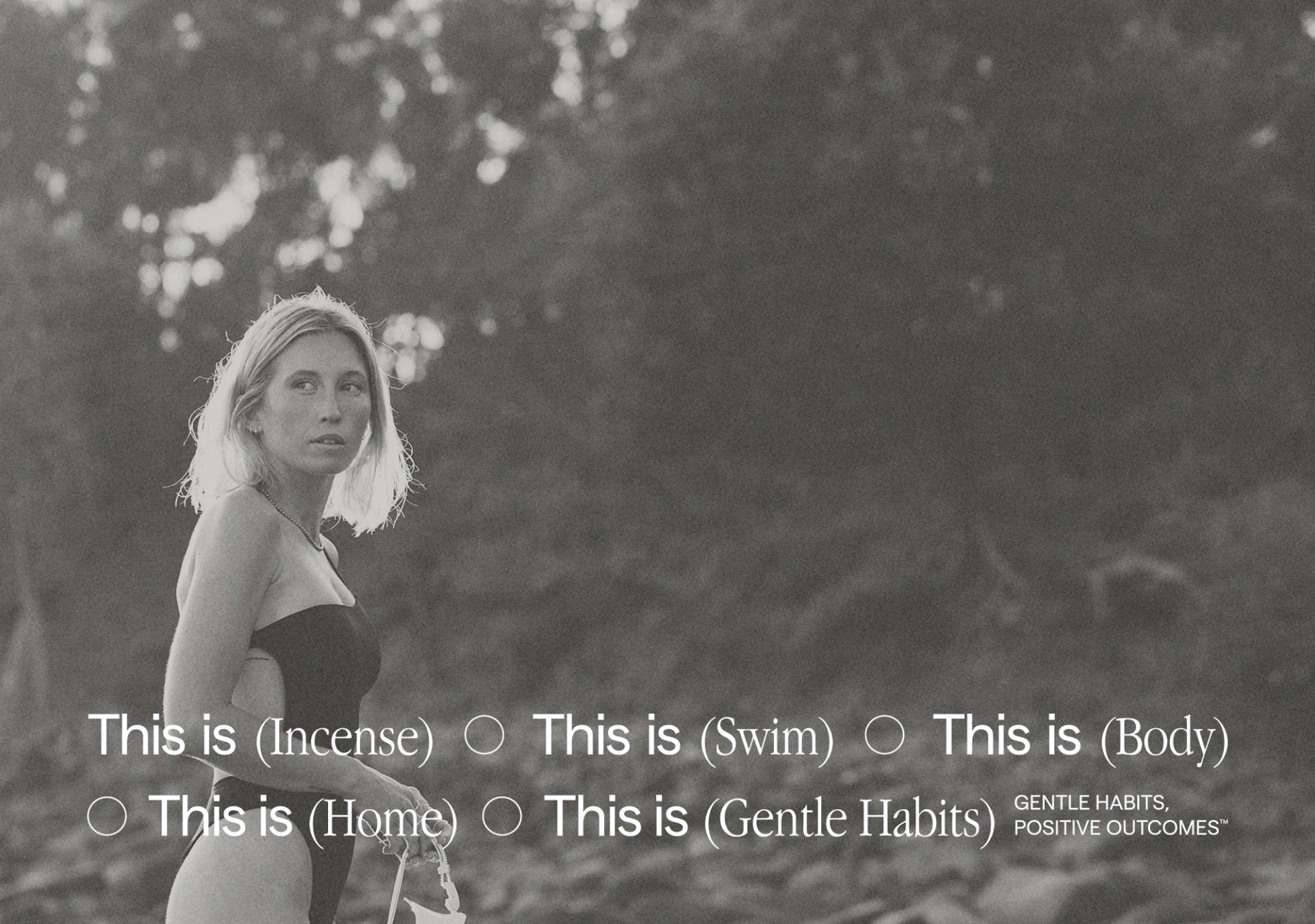
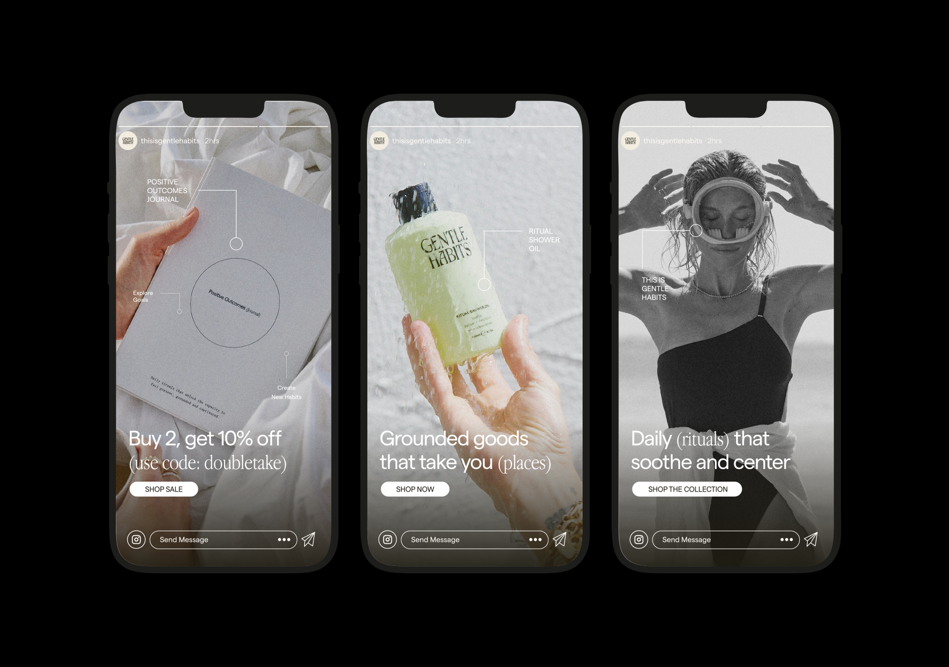
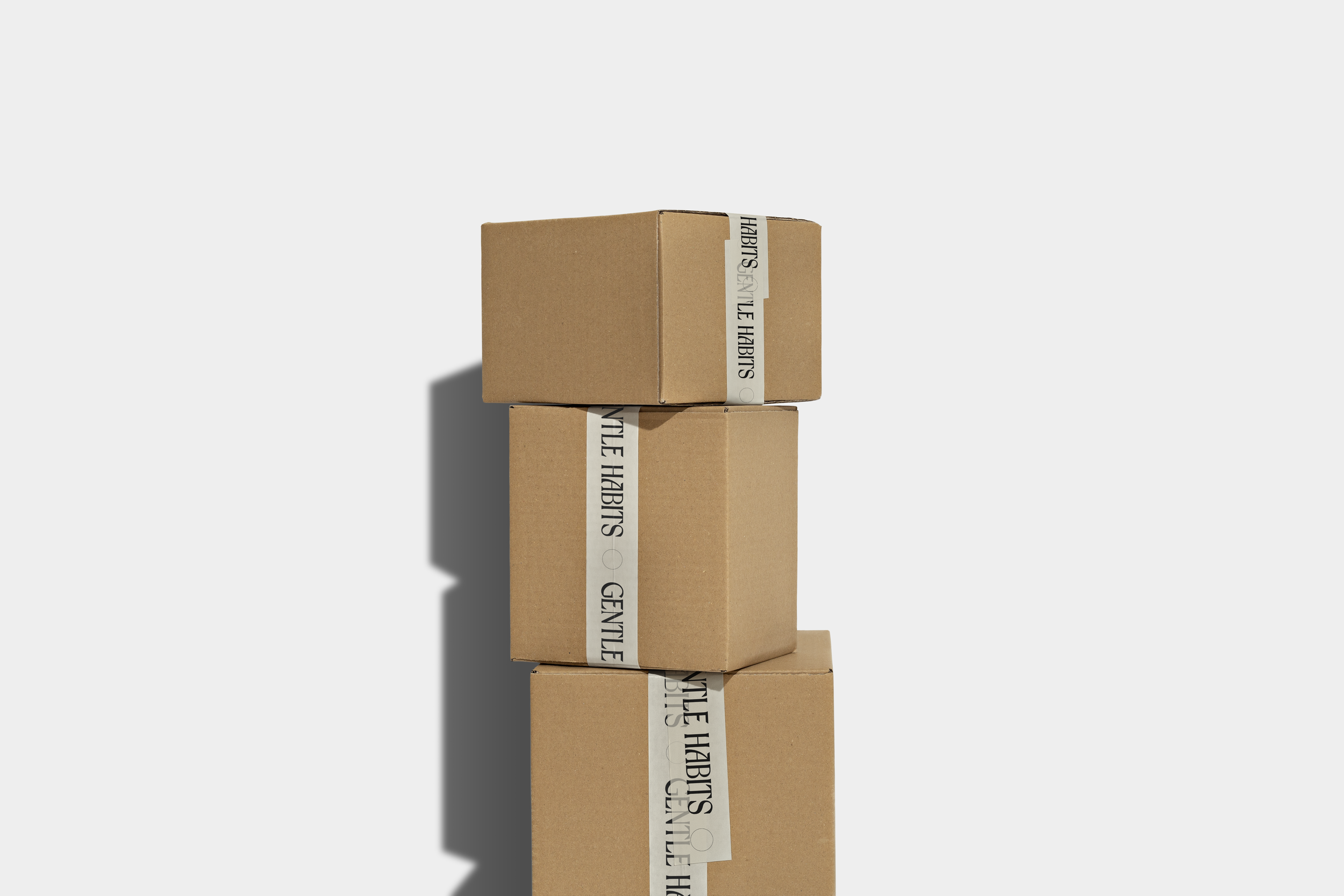
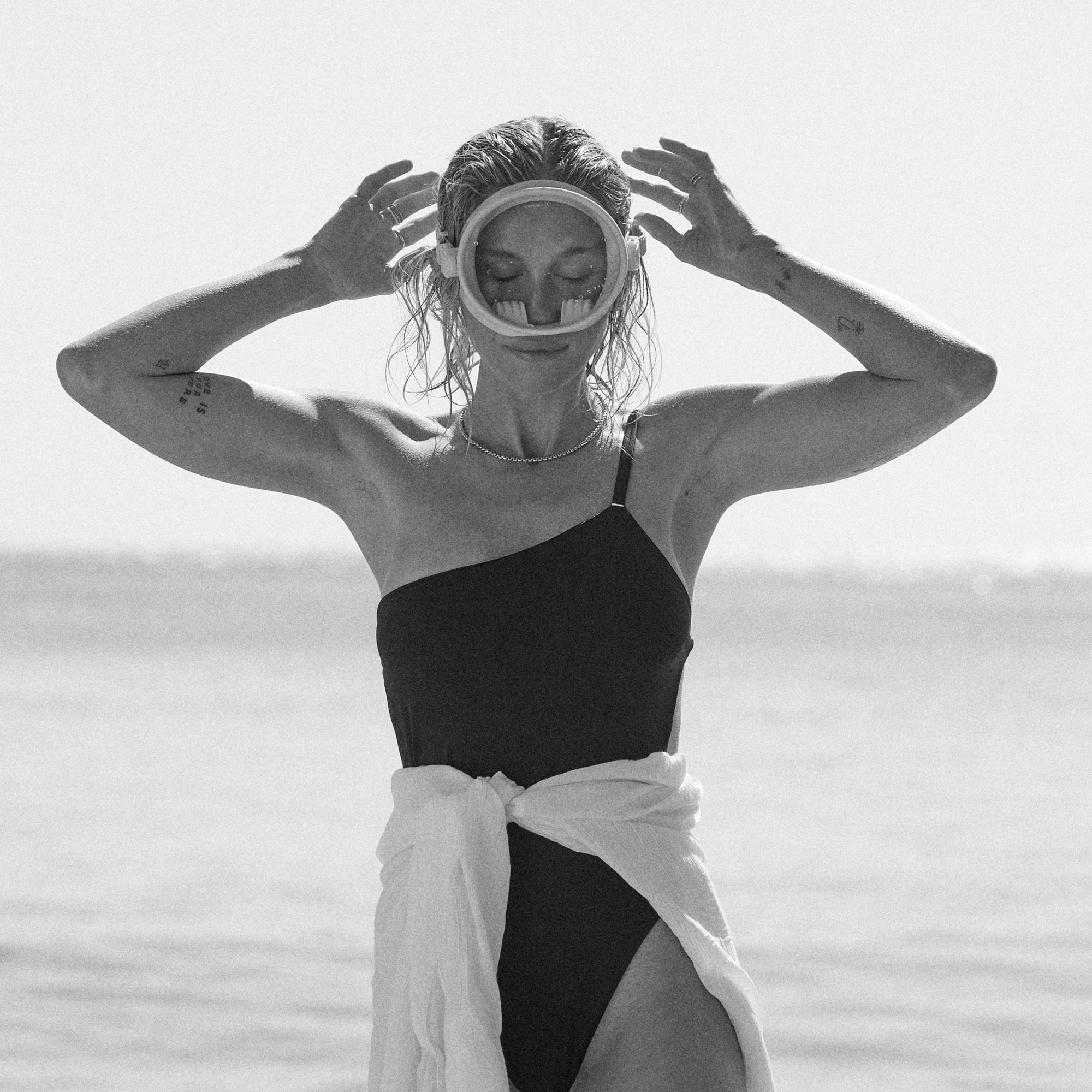
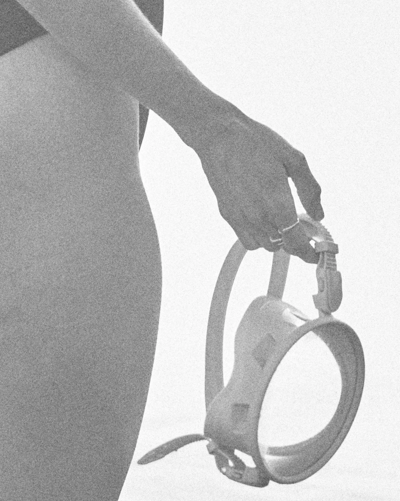
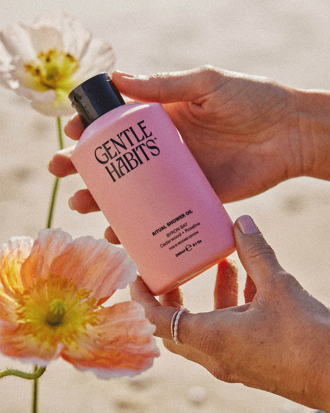
Gentle Habits create lifestyle products to help people find moments of stillness, joy, movement, love, motivation and self-reflection. After taking Australia by storm with her startup, This is Incense, founder and director Sophie came to us to re-develop her brand identity before launching her products into the global market.
Alongside her in-house and external creative teams, we helped develop a new visual identity and creative direction for Gentle Habits that would go on to influence product, packaging, campaign, photo and video, social media and other applications. The bold, organic and grounded visual identity represents Gentle Habits' salty, down-to-earth, and community-focused mission. Featuring a pared-back colour palette and strong, gender-neutral logo and type family, the wider Gentle Habits identity comes alive in the form of their vibrant product packaging colours which have been carefully crafted in-house to align with their existing incense products.
Brand Strategy & Naming: Studio Chenchen
Brand Identity & Packaging Design Direction: Read Only
Messaging: Ballet Season, Phoebe Golden
Packaging Production & Rollout: Claire McKeown
Campaign Photography: Jeremy Gryst
Other Photography: Caity Grace
Info

2
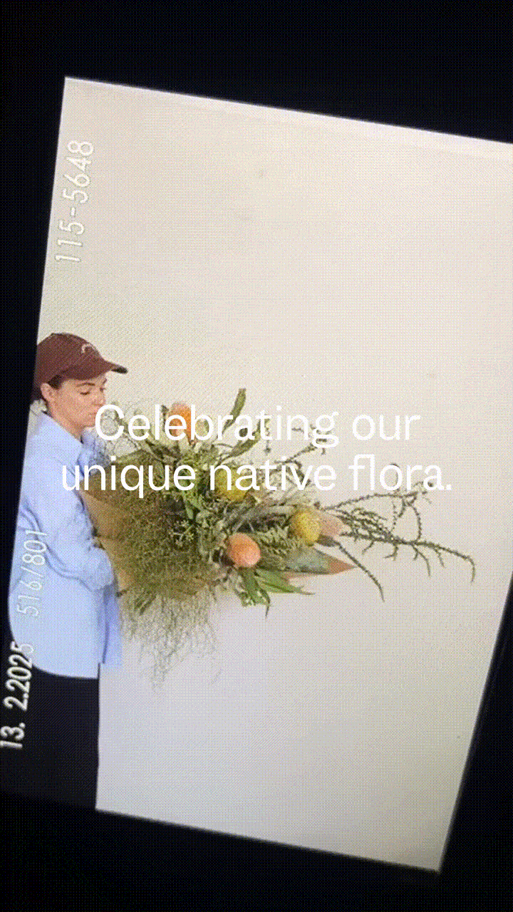
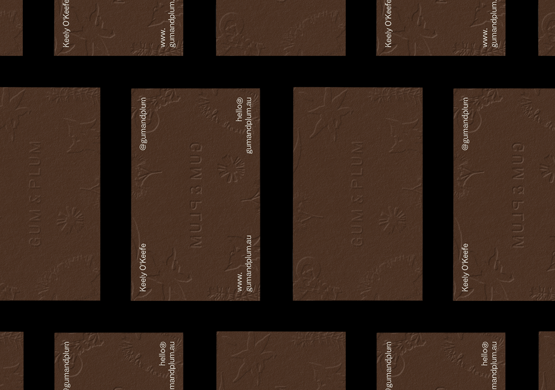
Gum & Plum
Floral Design, Creative
Brand Identity, Print
2025
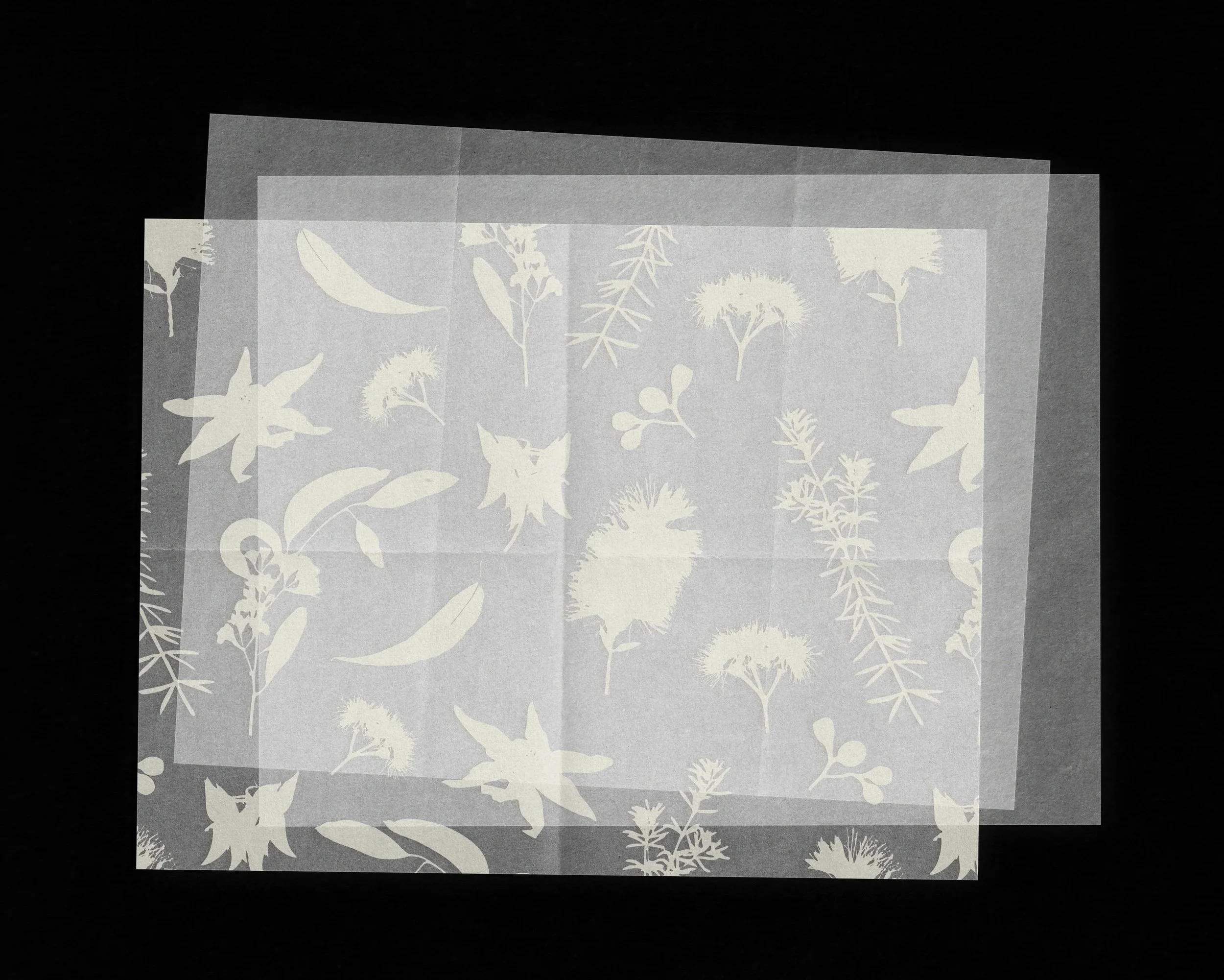
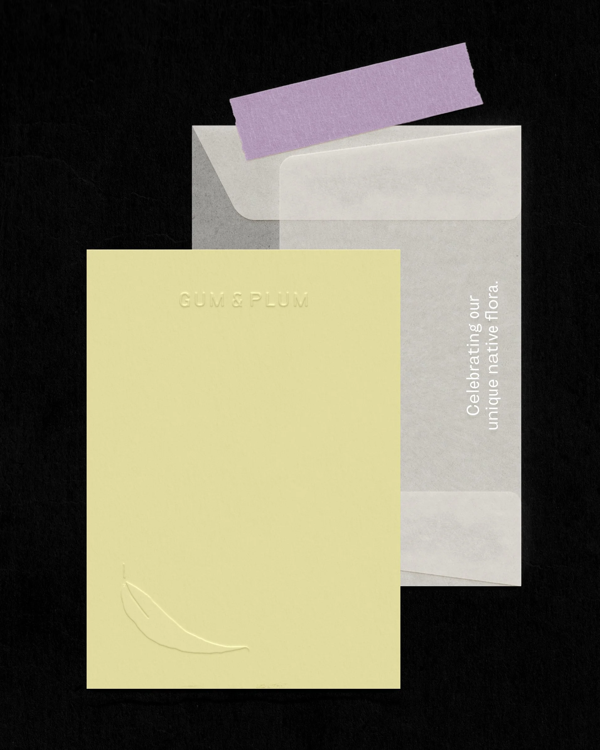
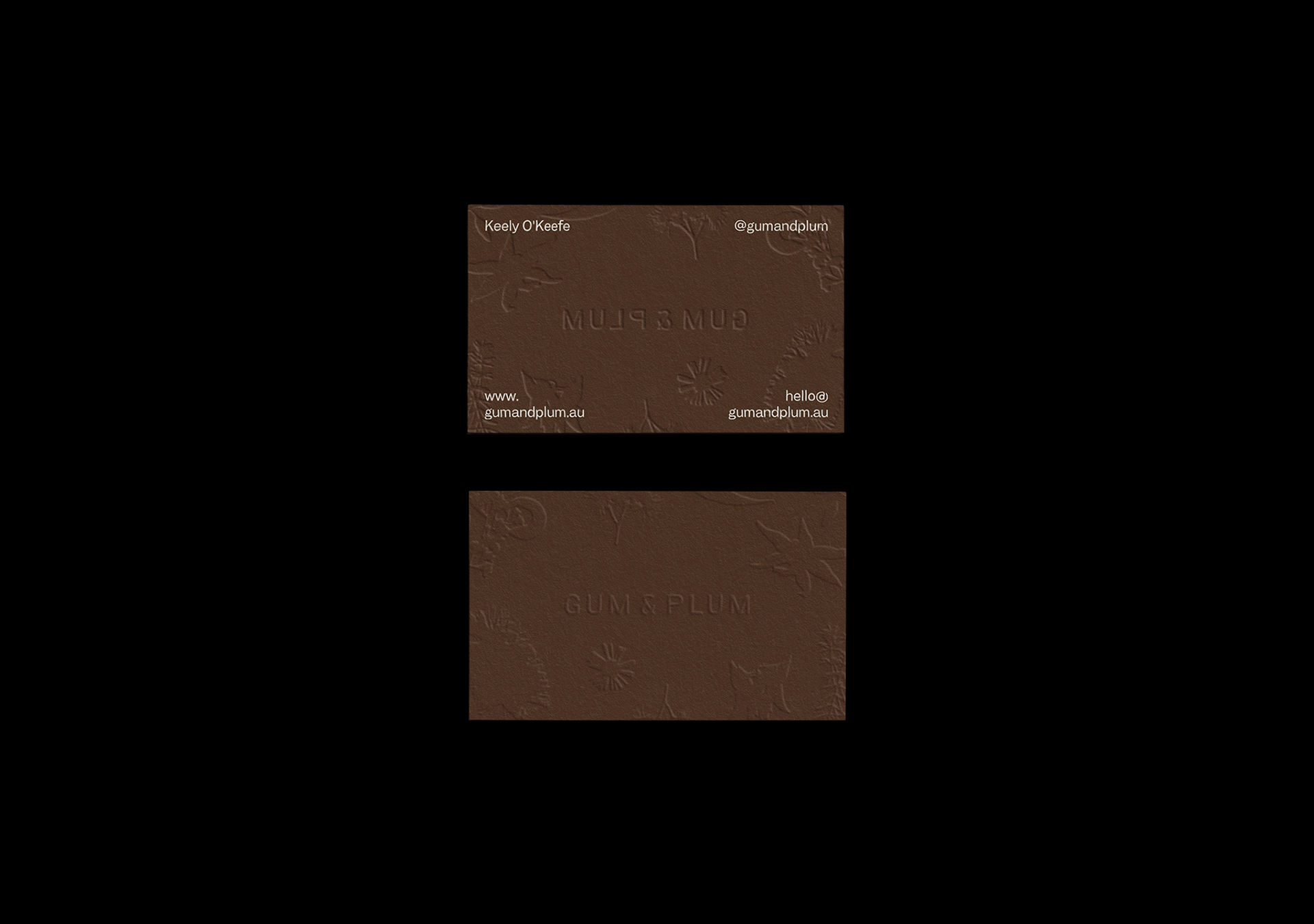
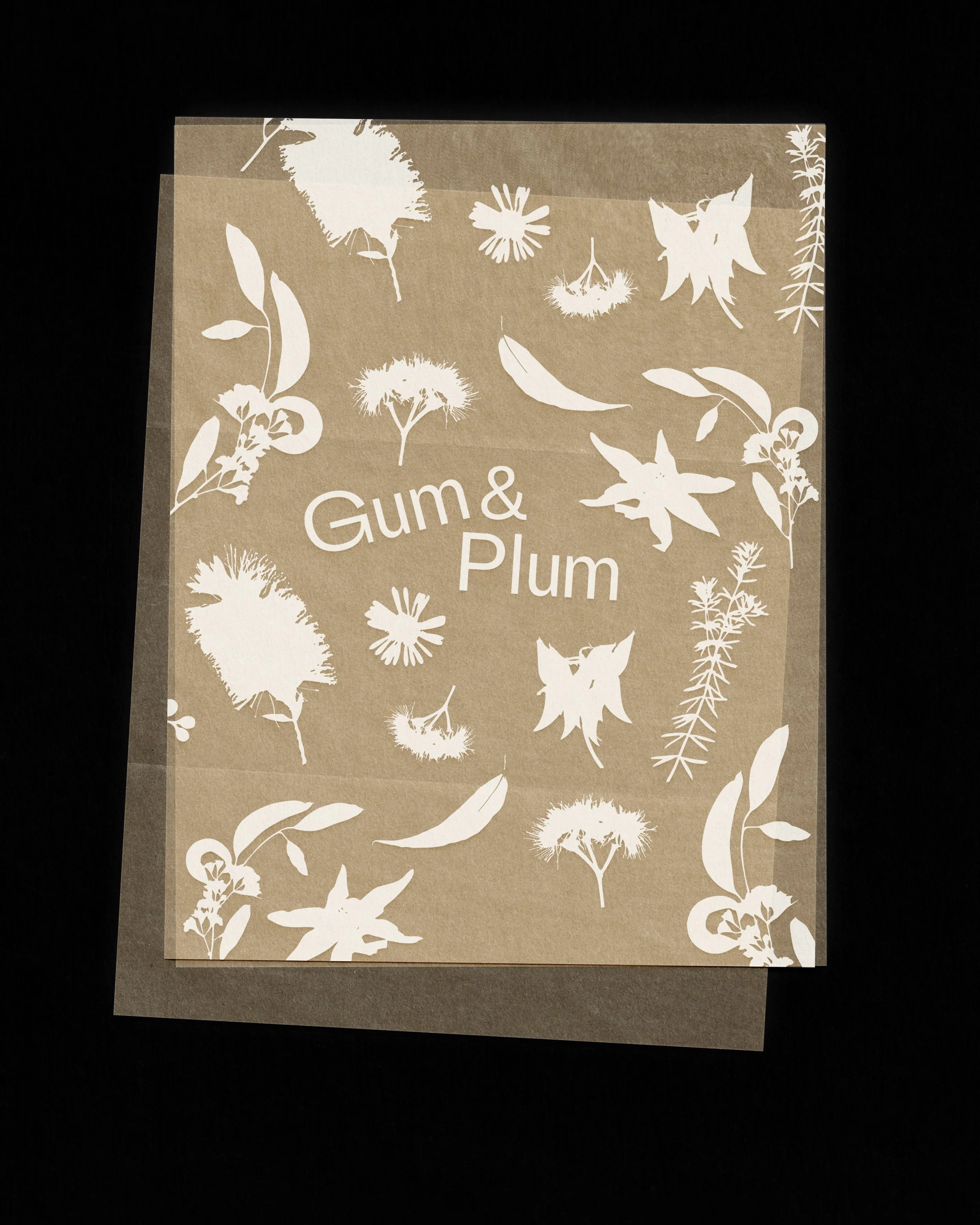
We worked with Australian floral designer, Keely, to develop the identity for her freelance studio Gum & Plum — something that not only ‘looked the part’, but also communicated her approach to flowering and values within the industry. Gum & Plum’s point of difference is that the work is developed solely using native Australian flowers and plants.
We proposed a concept that was earthy, whimsical, quirky and natural—wrapped up in the underlying themes of ‘sustainability and preservation’. After all, in alignment with Gum & Plum’s value of a ‘mostly untouched landscape’, they are committed to elevating our nation’s native flora through artistry, not altering it.
The primary visual components of the identity were designed to communicate this exact message: through handmade scans of native flowers-turned-silhouettes, sheer and elegant archival paper overlays, and collateral manufactured with embossed finishes and eco-friendly inks. Each typeface in the identity was also a nod to heritage, chosen not just for their look and feel, but for the fact that they are designed by independent Australian foundries.
Info
3
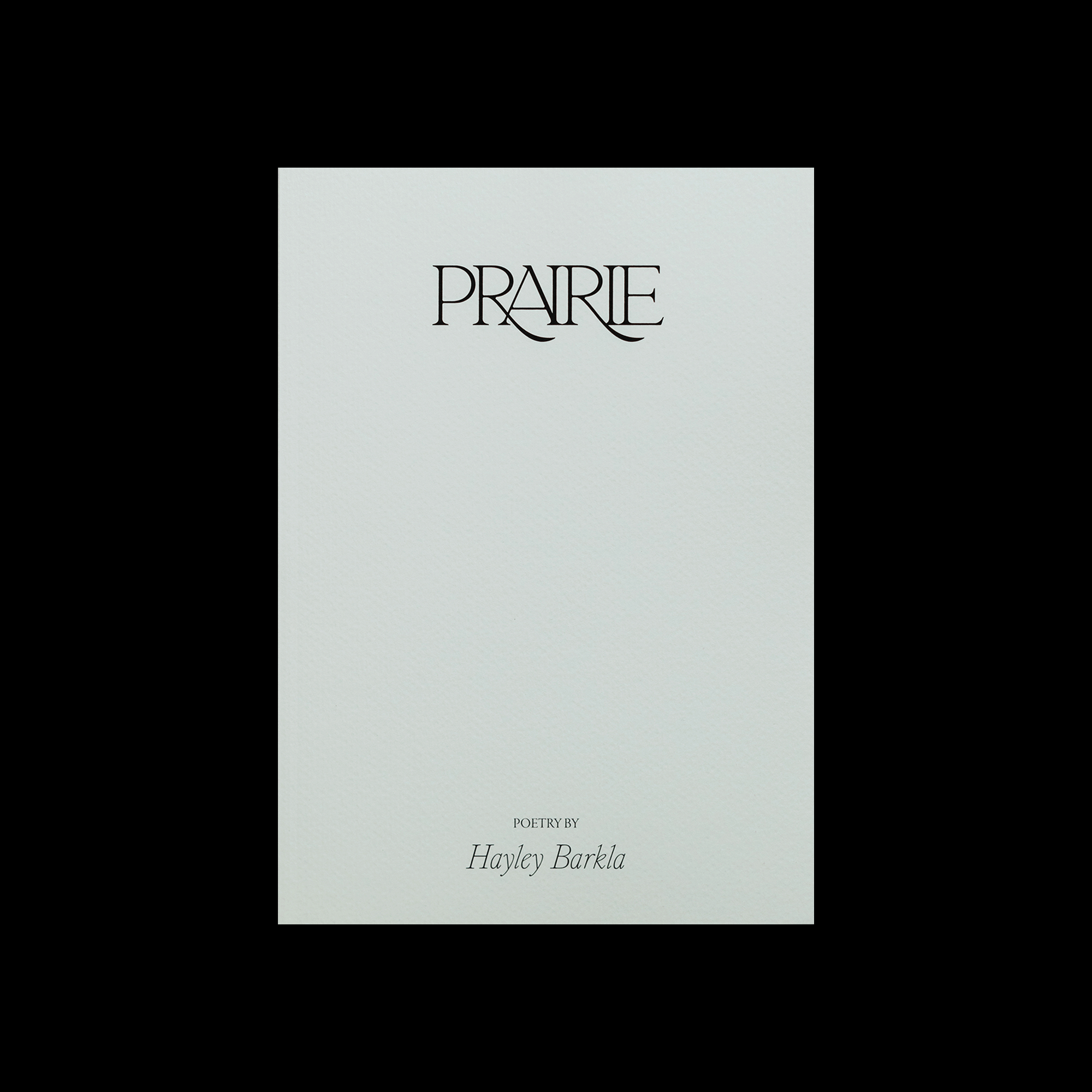
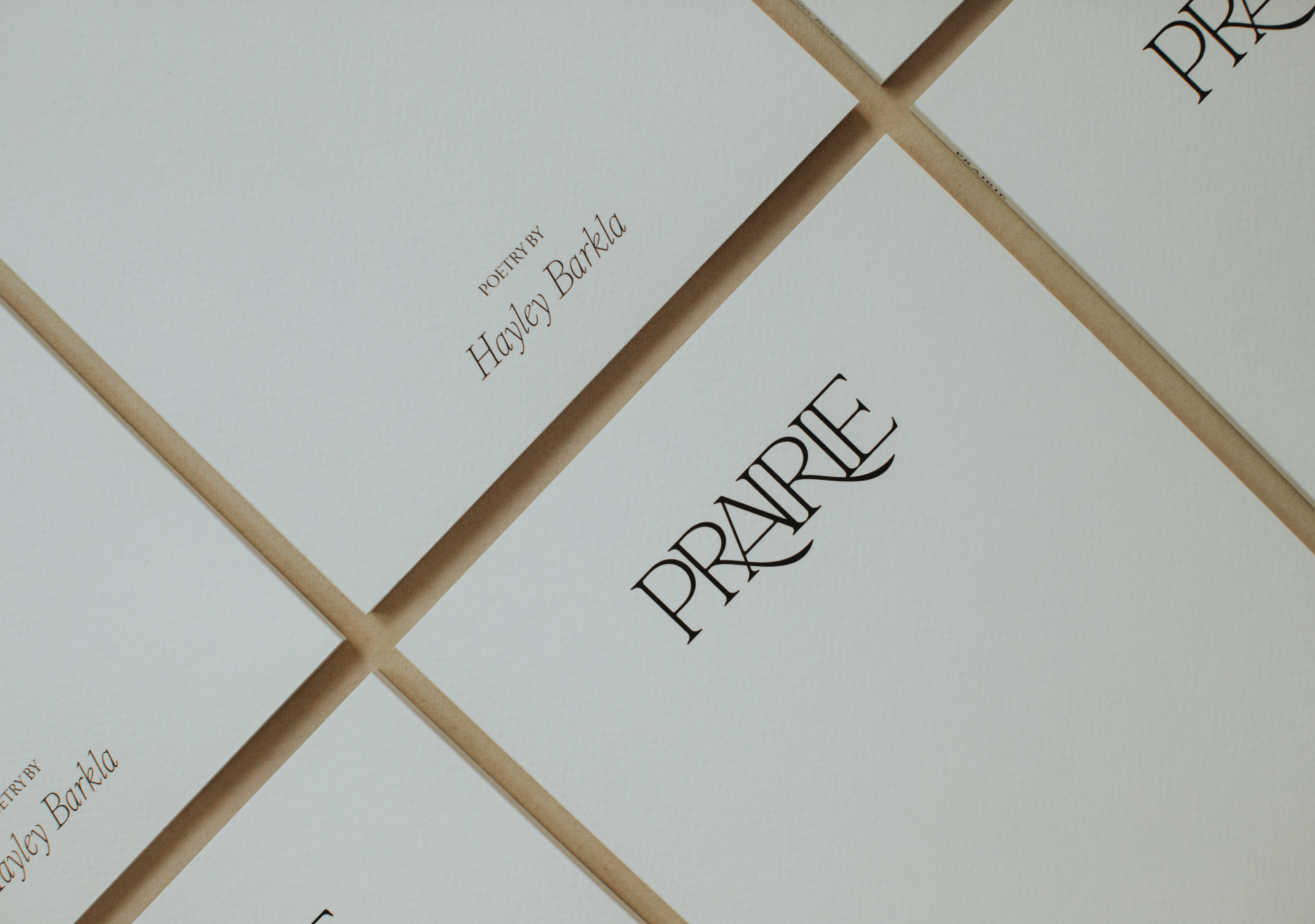
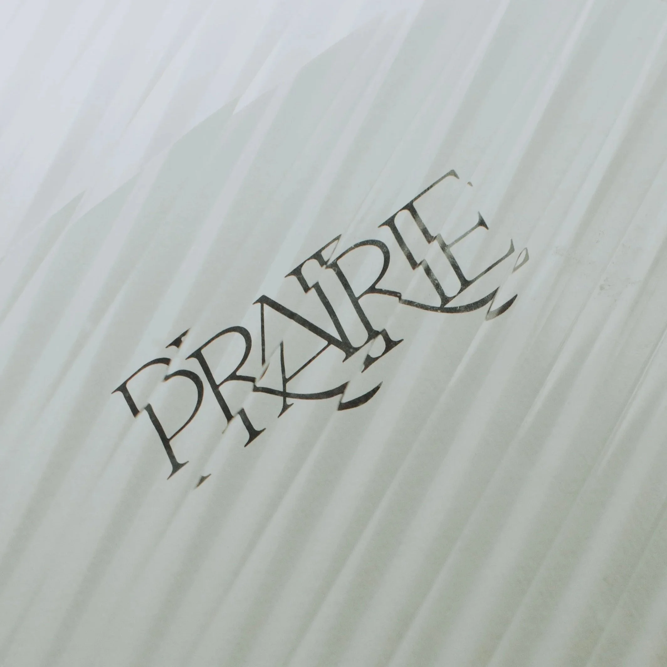
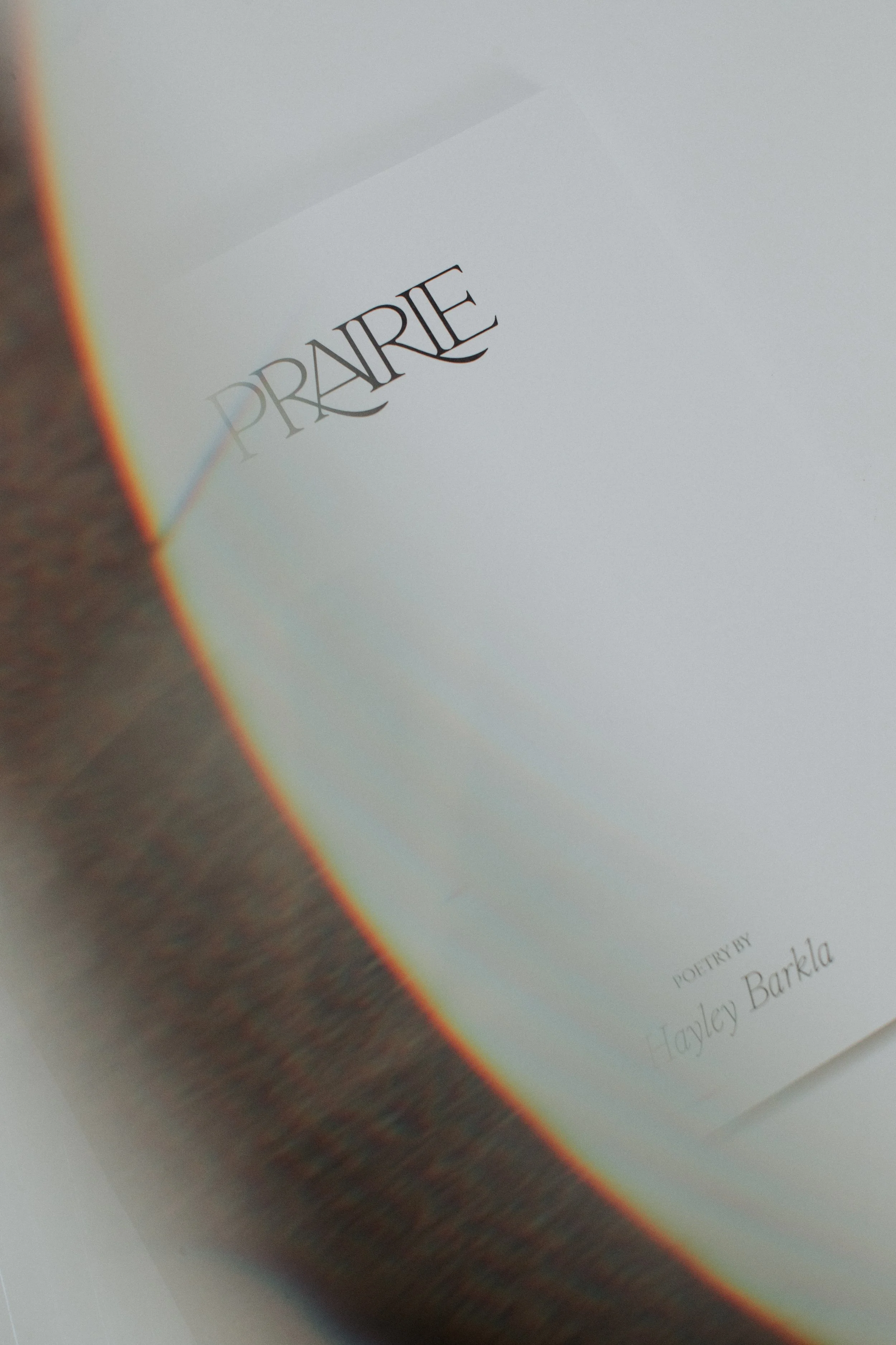
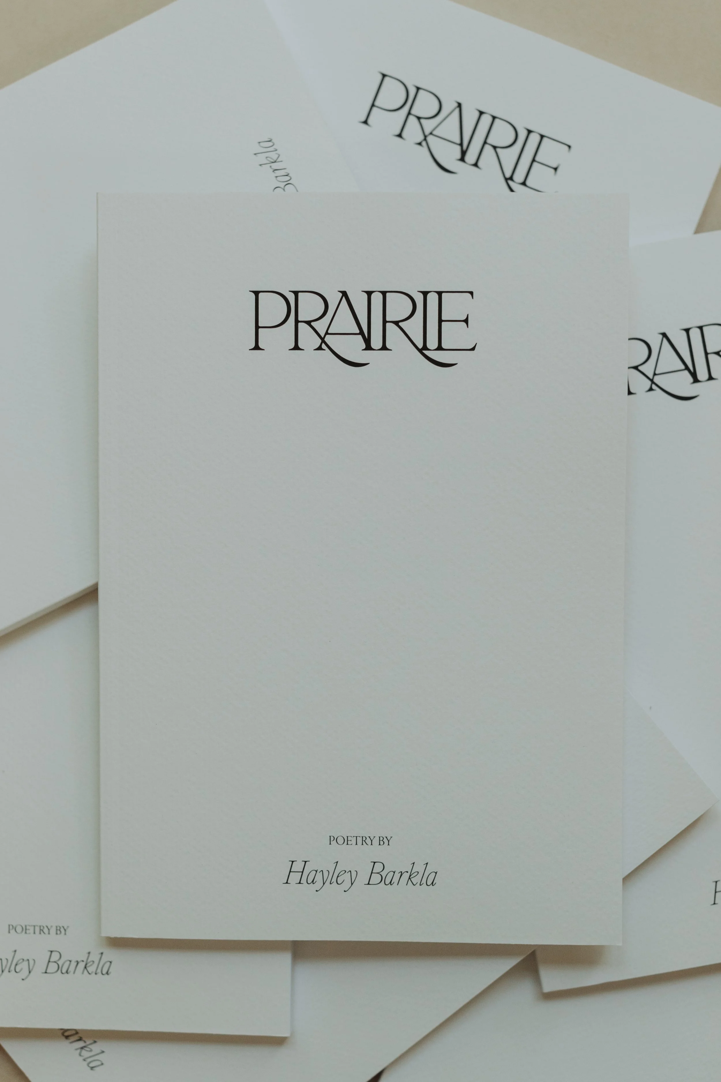
Prairie
Publication
Art Direction, Typesetting
2021
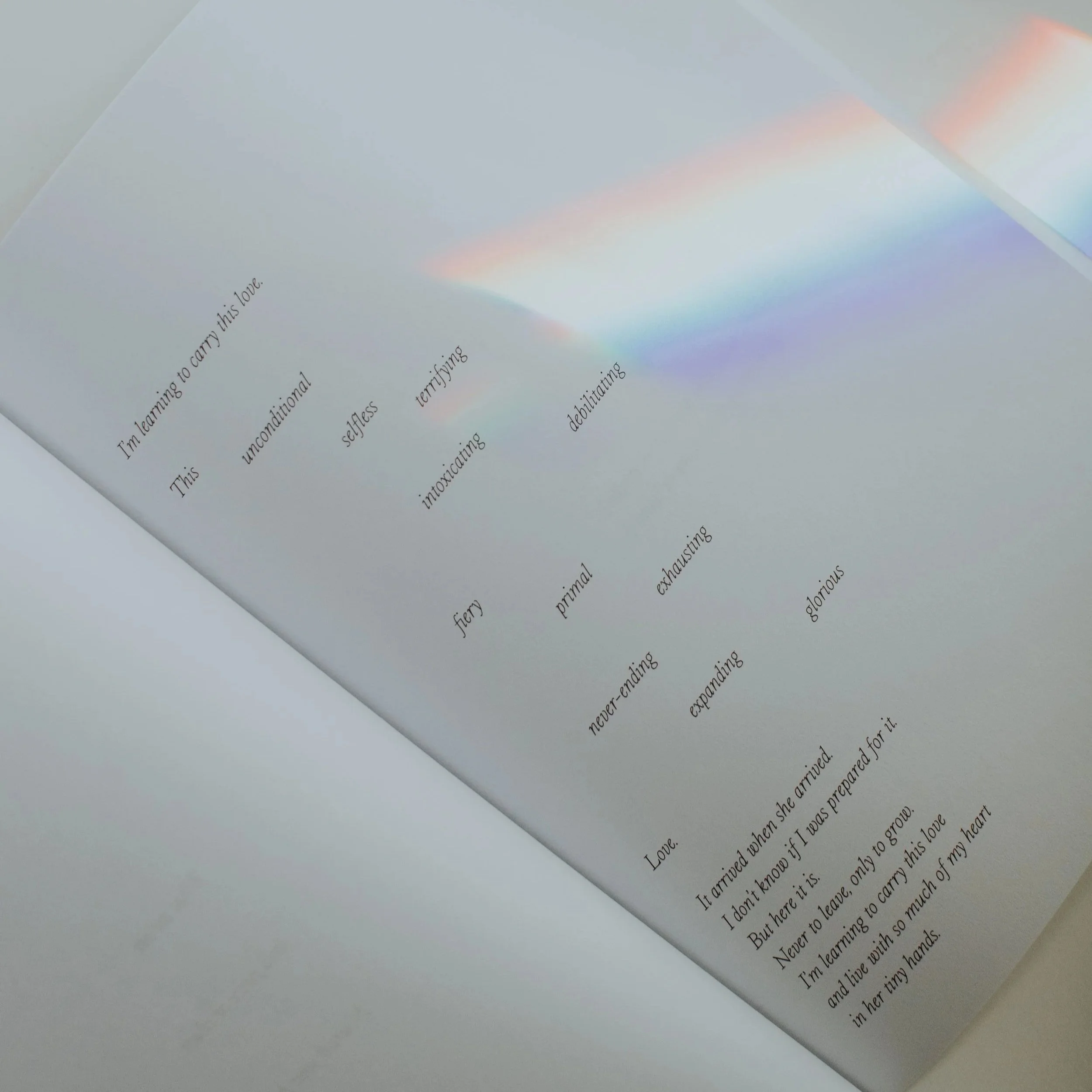
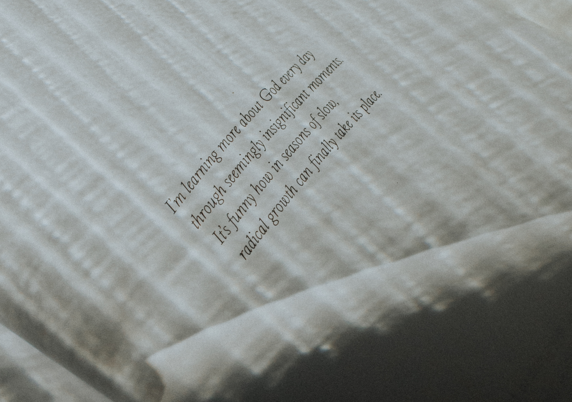
We worked with writer and poet Hayley Barkla to bring to life a series of intimate and personal poems in the form of a published book. Described by Hayley as “a garden”, Prairie is a collection of musings from a season of deconstruction and reconstruction in her own life. With themes ranging from faith to friendship, to habits to time, there is a deep ebb-ing and flow-ing weaved throughout the content which inspired many of our design decisions.
From the title logo and typefaces, through to the layouts on each page, there is an intentional feeling of movement and back-and-forth throughout. The structure of the manufactured book was highly considered, with the aim being to create a piece that felt raw and handmade, yet also elevated and of quality. Our goal was to create something that wasn’t immediately flashy, but instead more subtle in it's beauty. Manufactured with a textured paper cover and delicate inner pages, all of these elements ultimately brought the concept of Prairie, and the author’s words, to life.
Printing: McPherson's Print
Portfolio Photography: Christian Barkla
Info

4
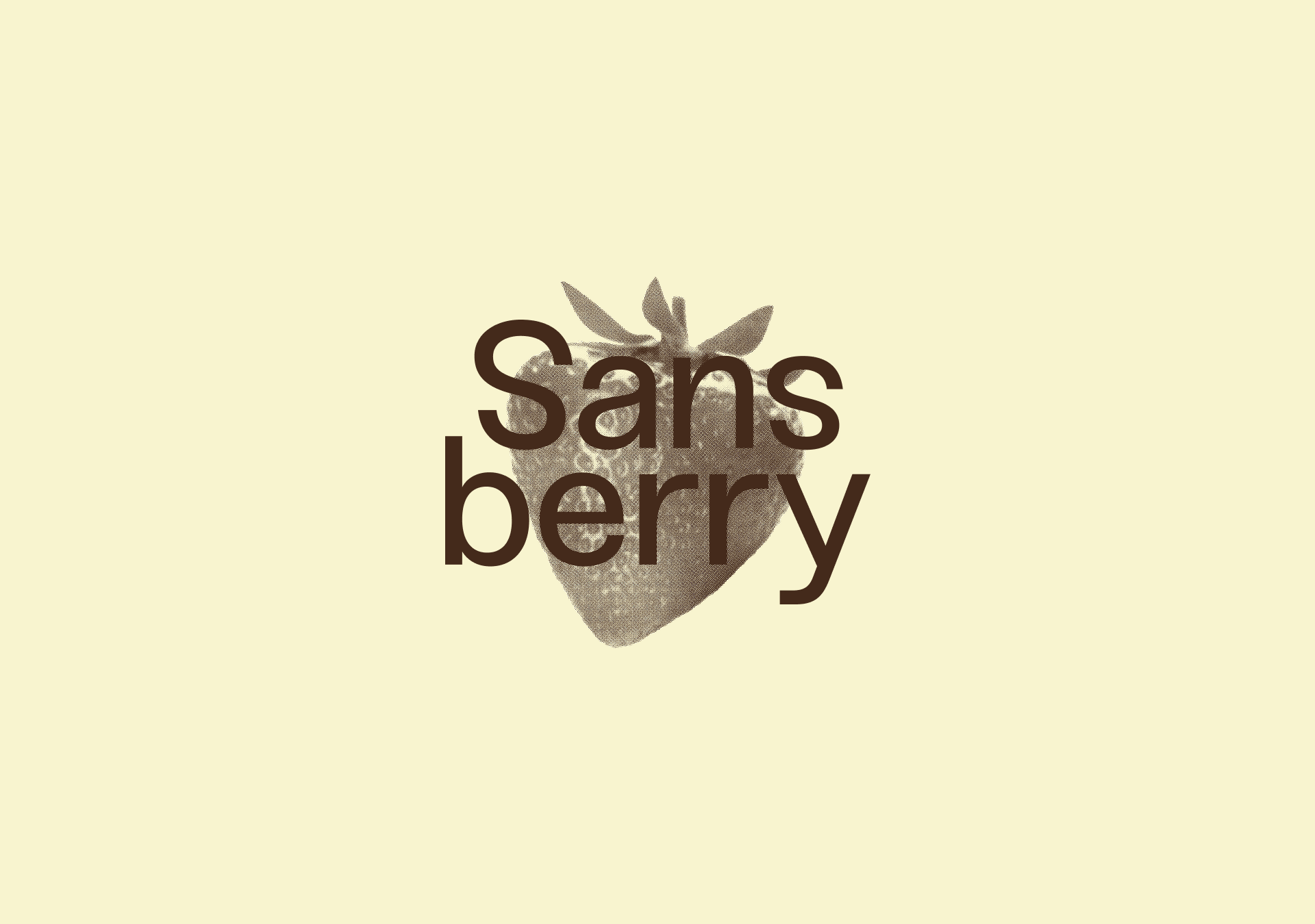
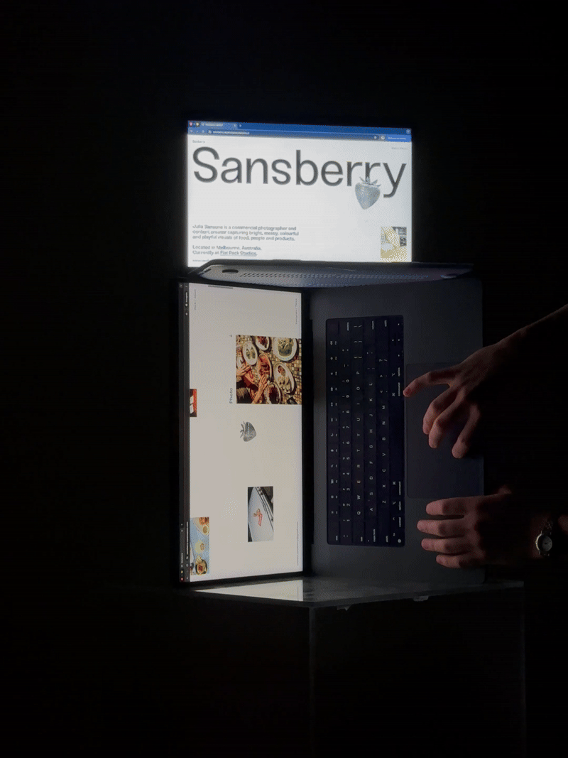
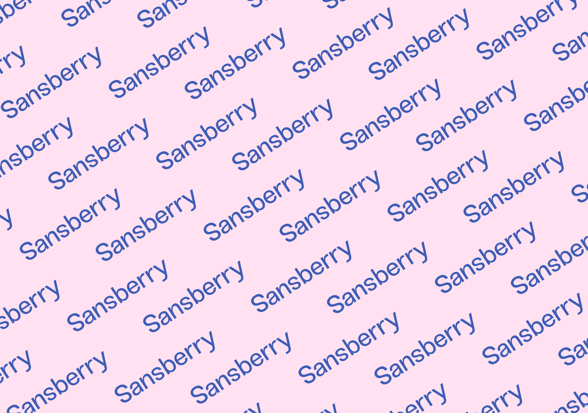
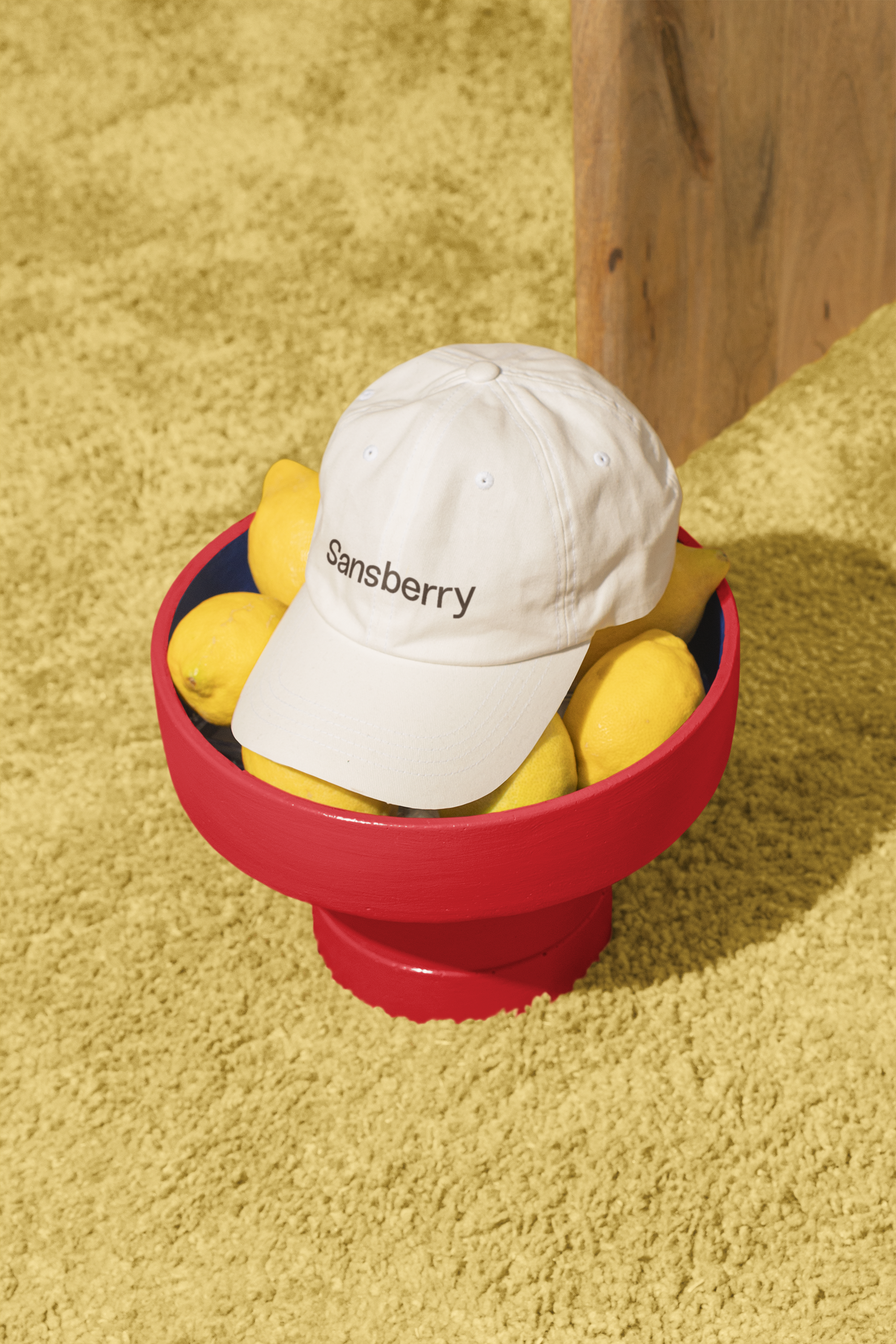
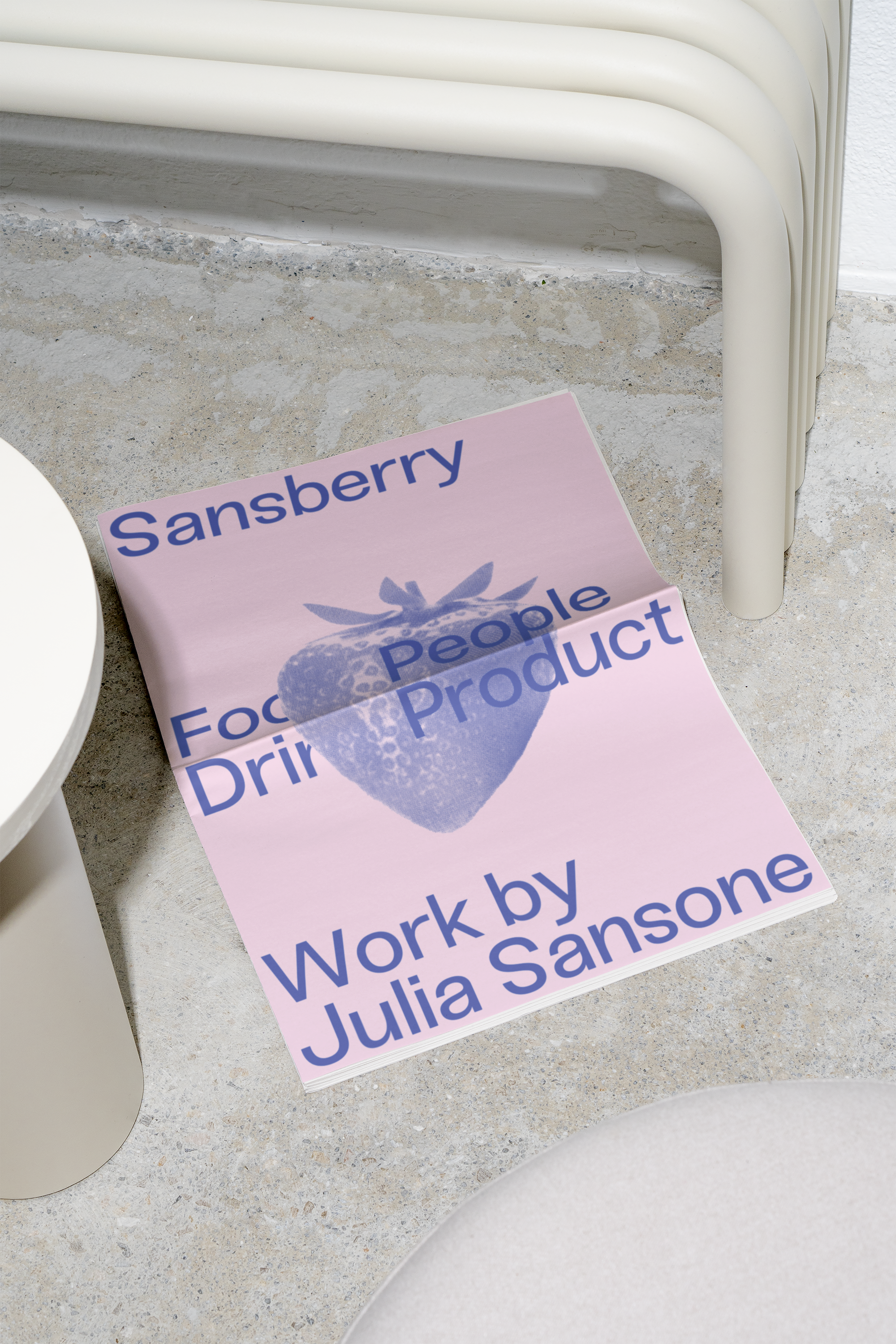
Sansberry
Creative
Art Direction, Identity, Website Design, Website Development
2025
Sansberry is helmed by Julia Sansone, a Melbourne-based commercial photographer and content creator specialising in capturing food, people and products. Her approach and style are memorably colourful, messy and playful—qualities that ensure her work always speaks for itself.
We worked closely with Julia to design a digital brand identity and online home that would honour her unique portfolio, and act as an extension of her art direction capabilities. With a strong vision in mind, Julia envisaged a brand experience that felt reminiscent of printed zines and lofi media— inspired by multi-layered risograph printing and archival printing styles. What culminated from this creative exploration was nothing short of an exciting explosion of colour, texture and typography, all held firmly in place by the guidelines of editorial minimalism.
Portfolio Videography: Sansberry
Info
5
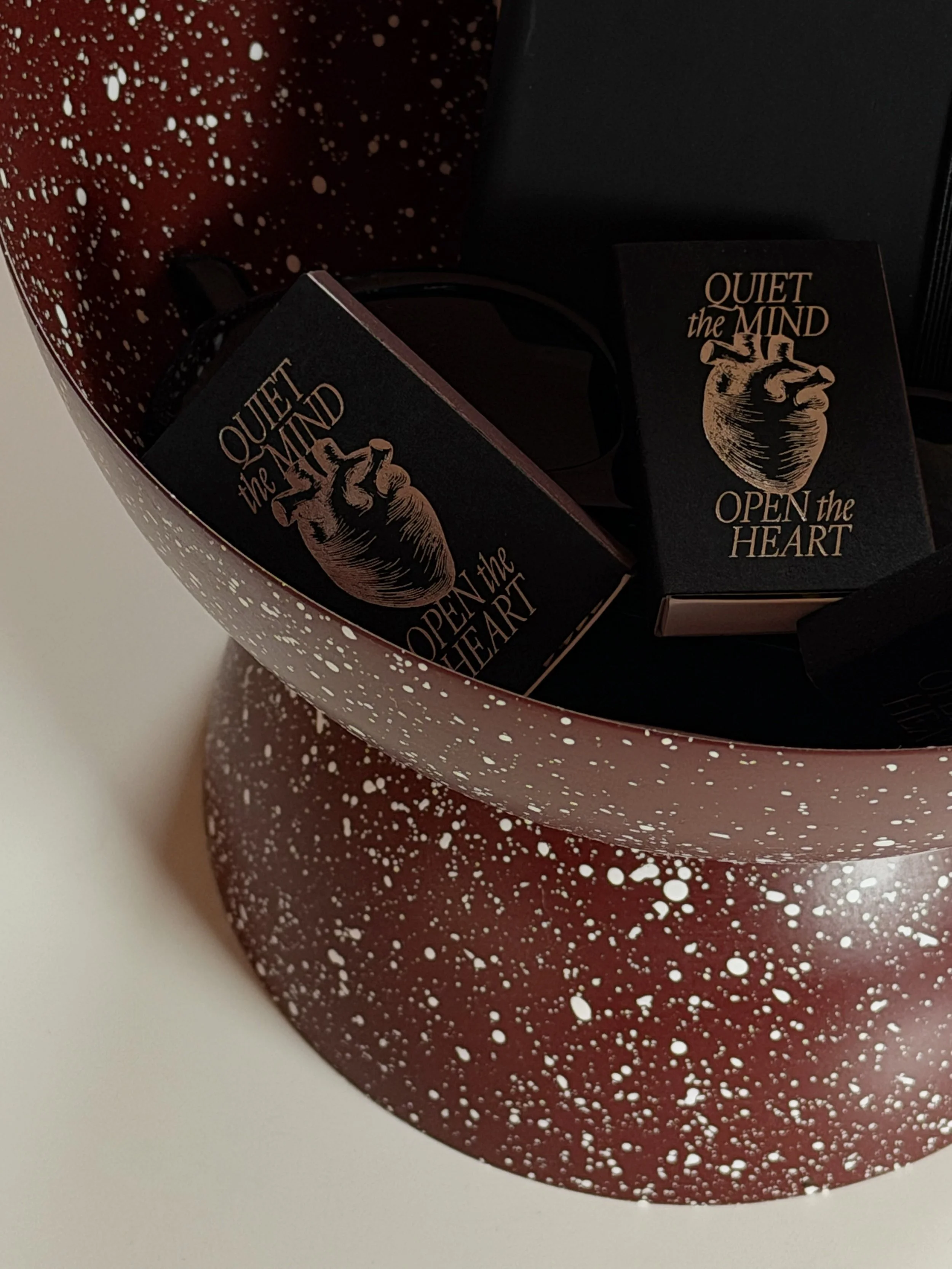
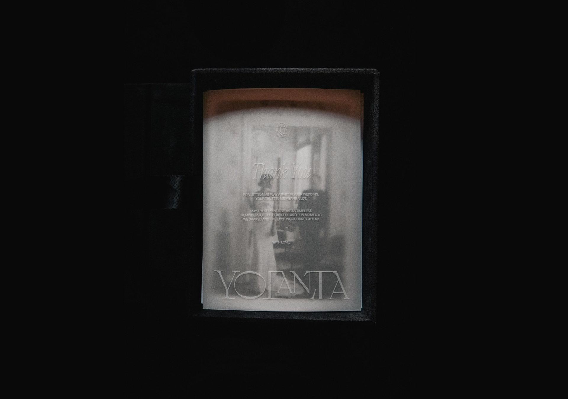
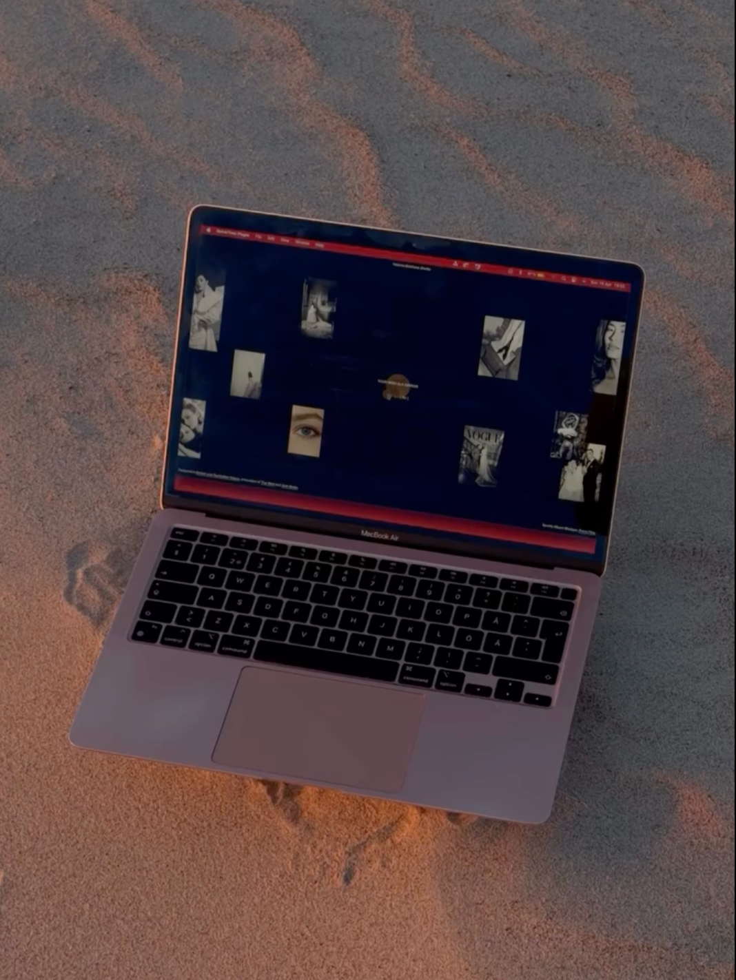
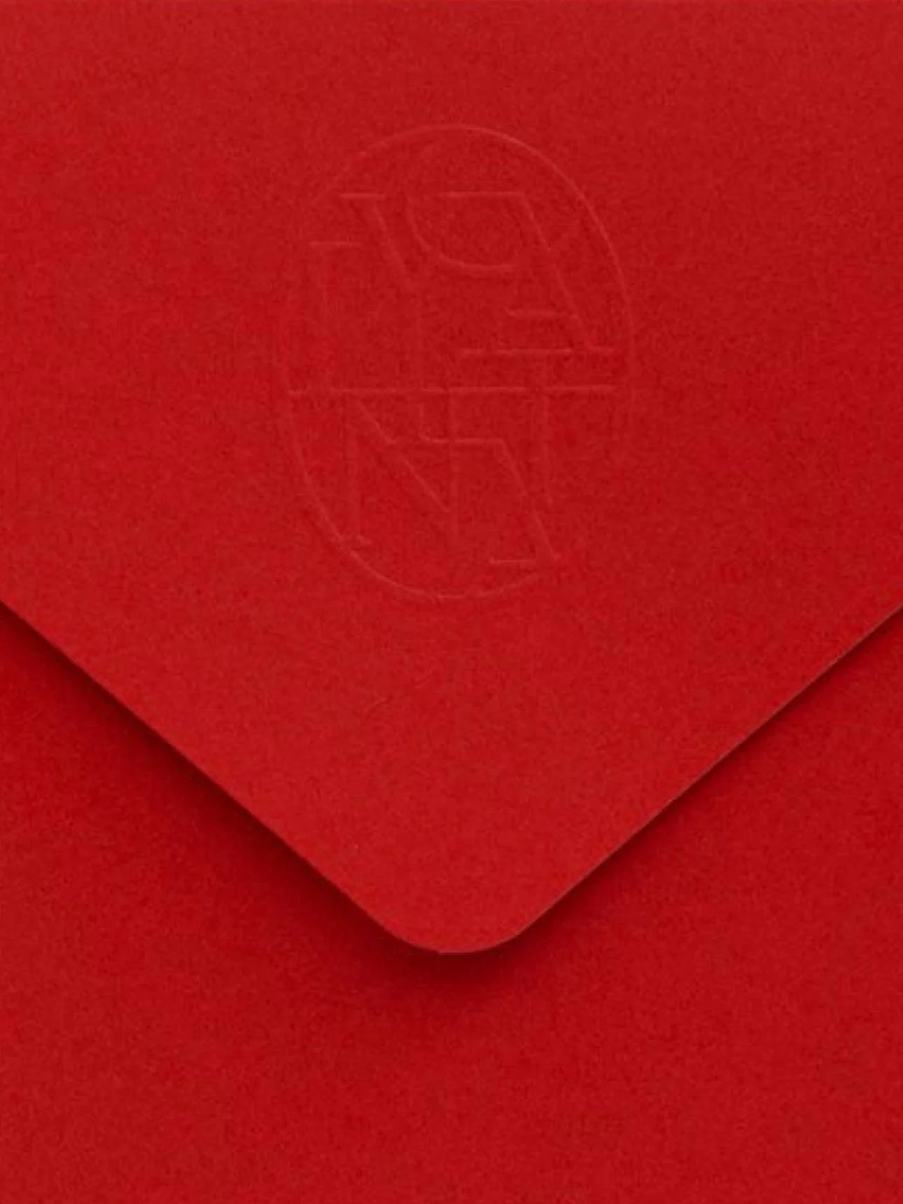
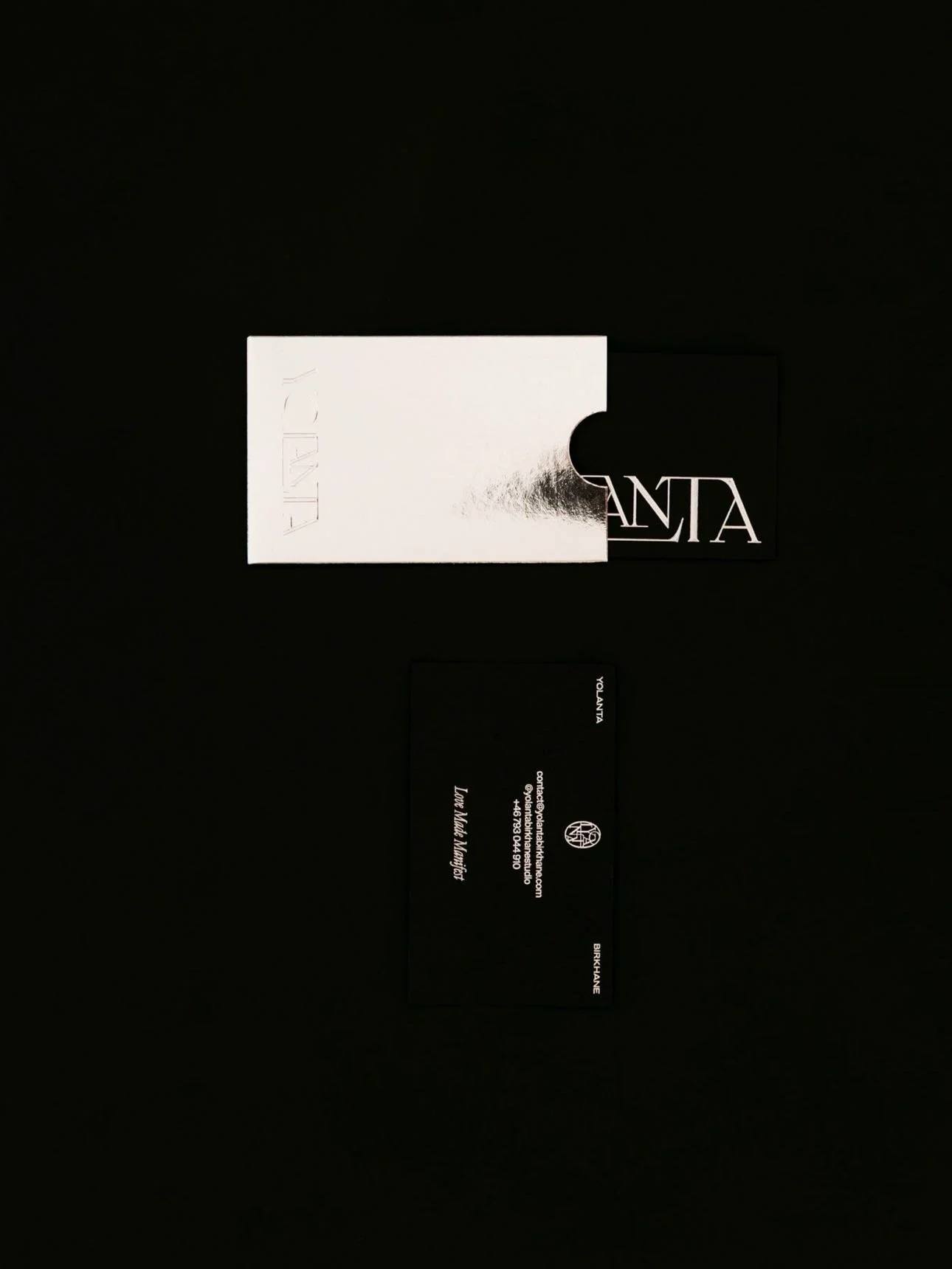
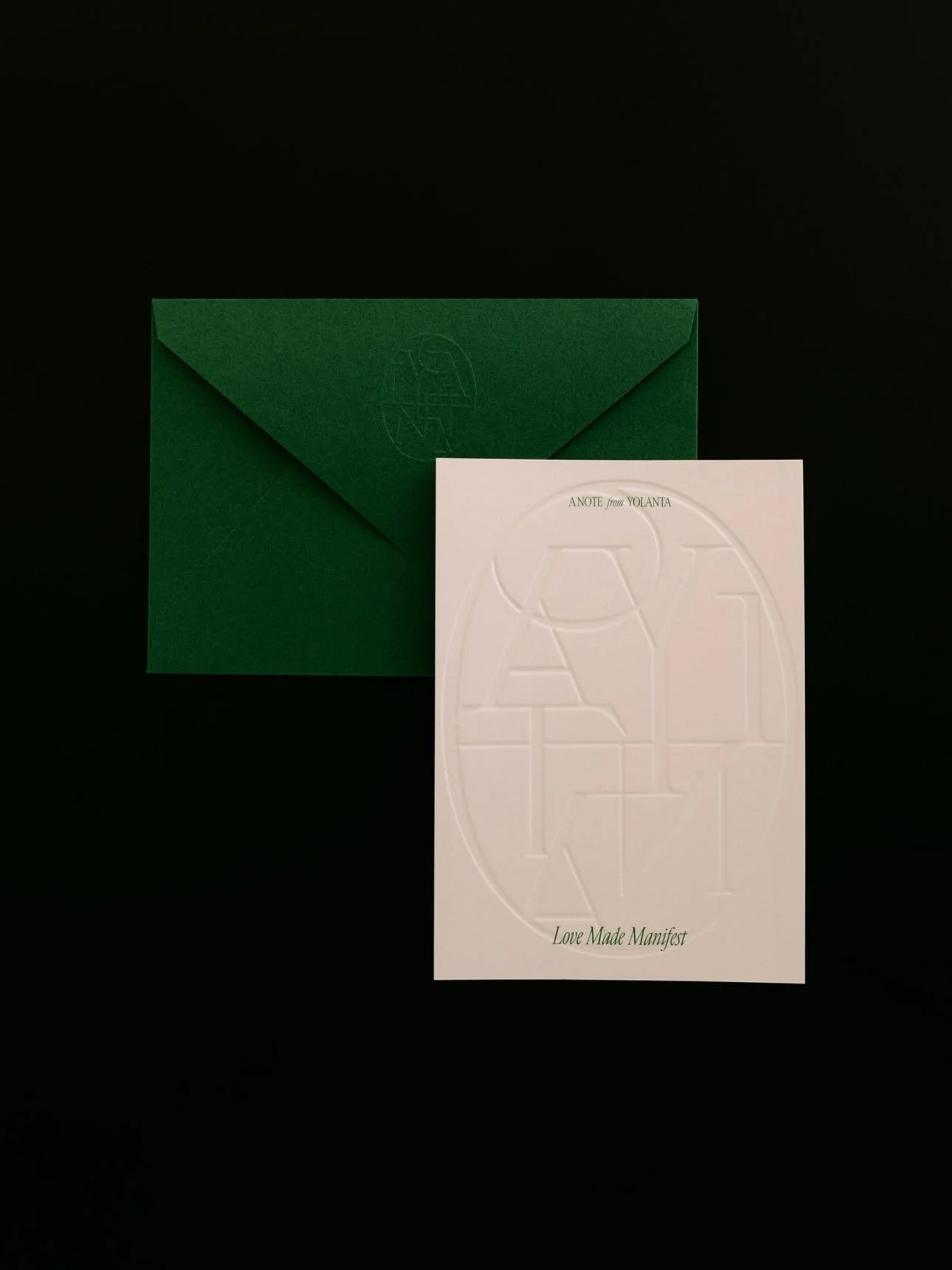
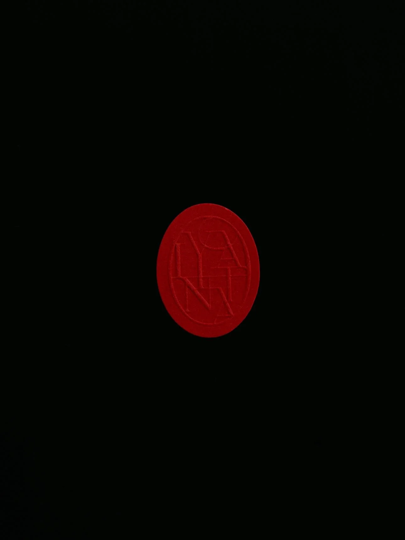
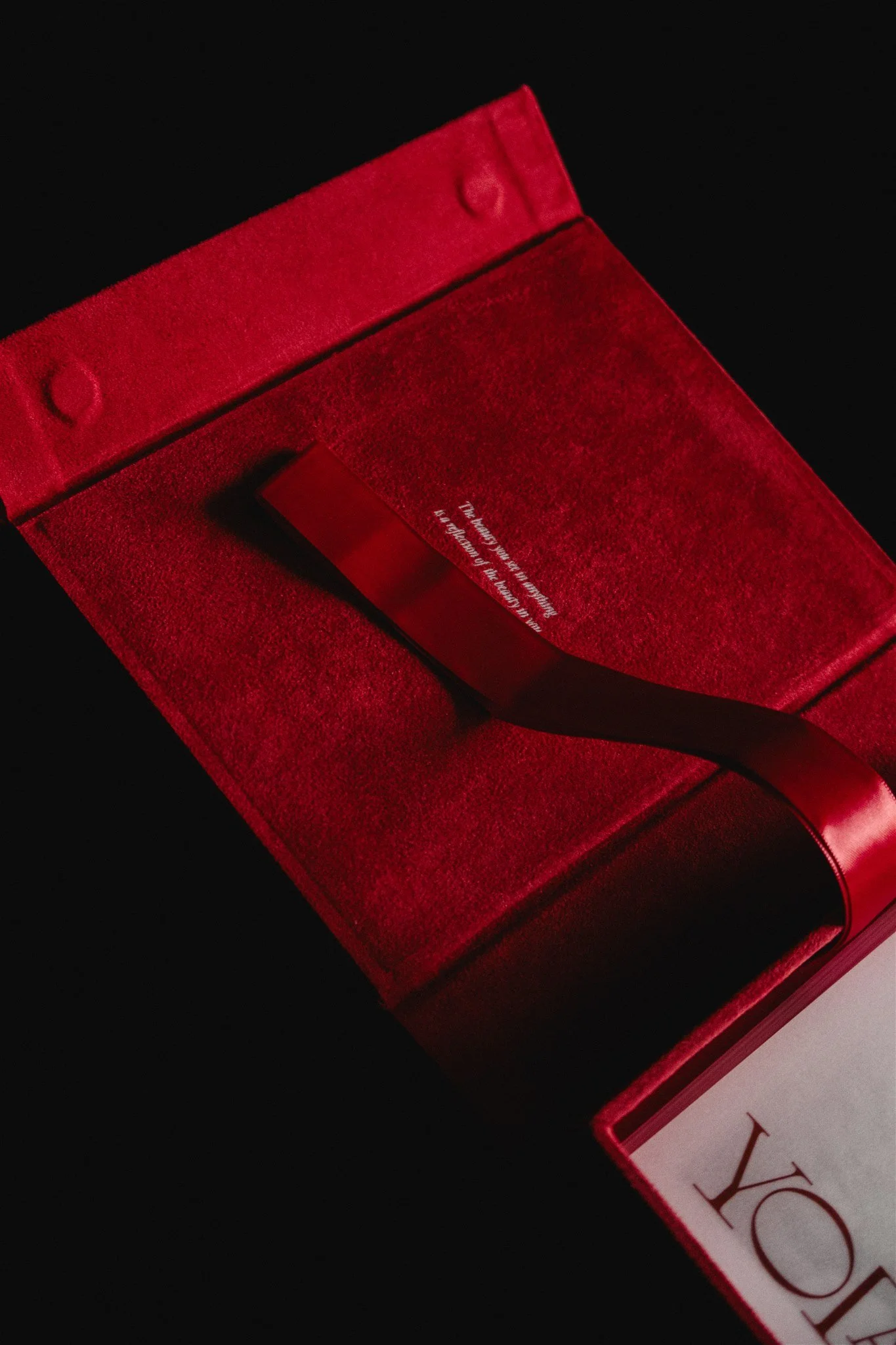
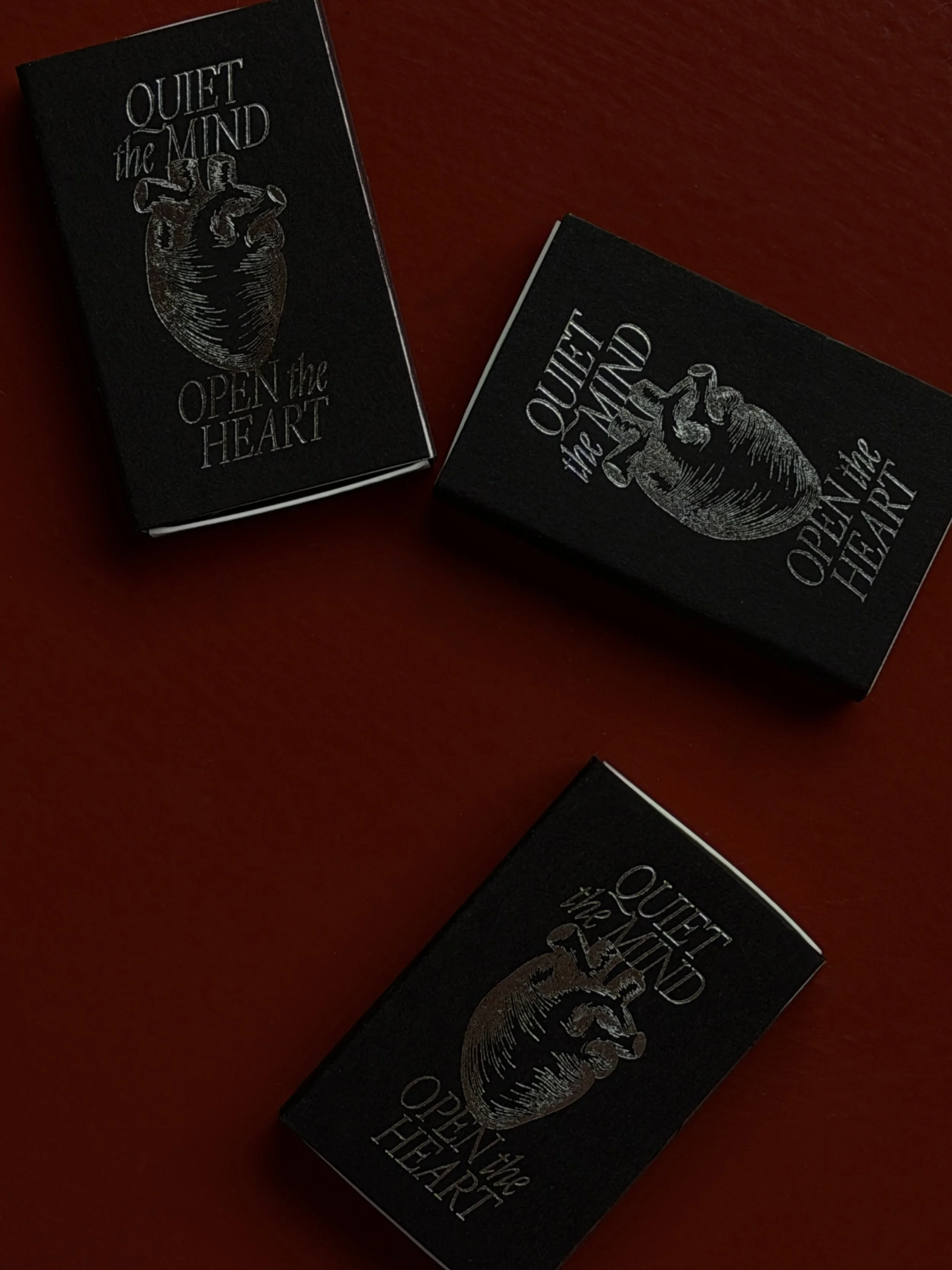
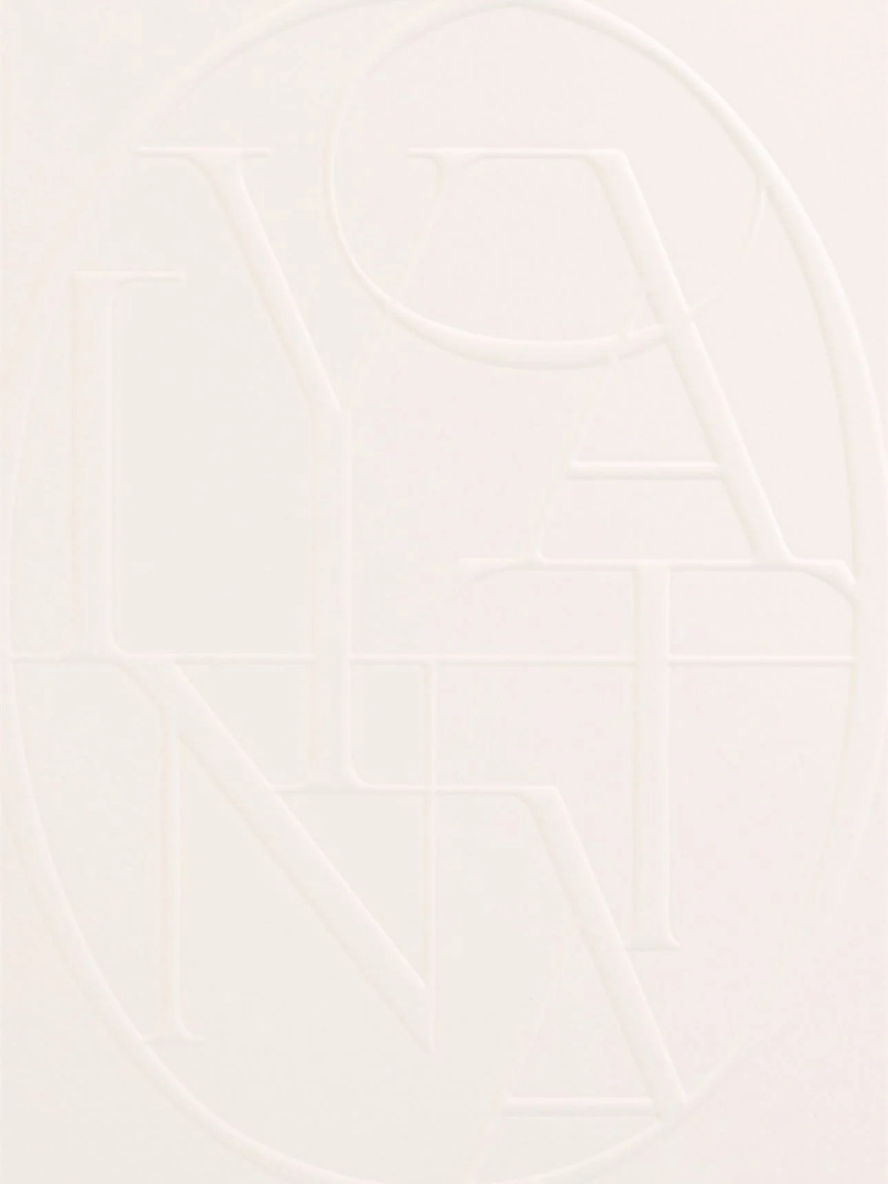
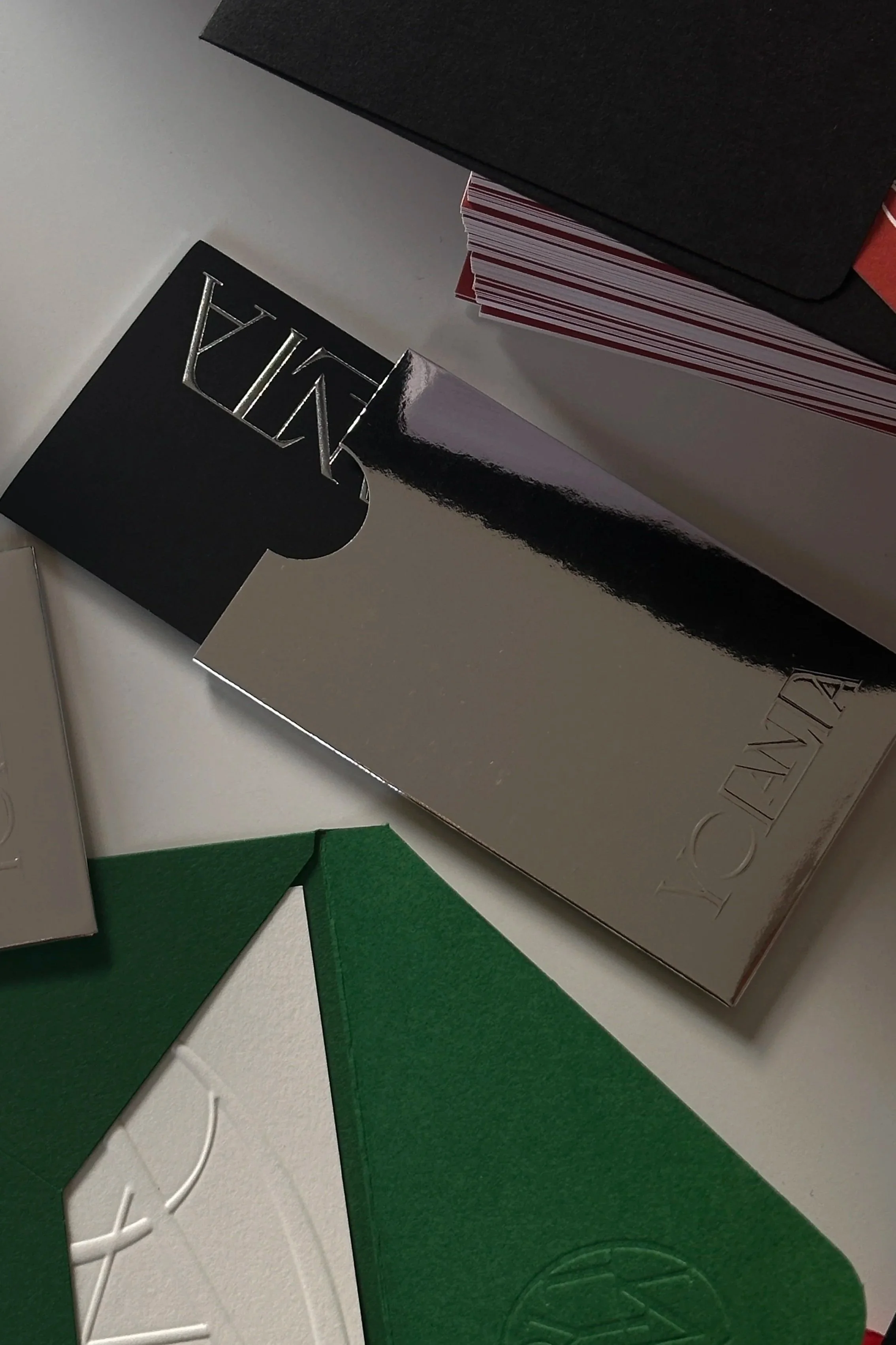
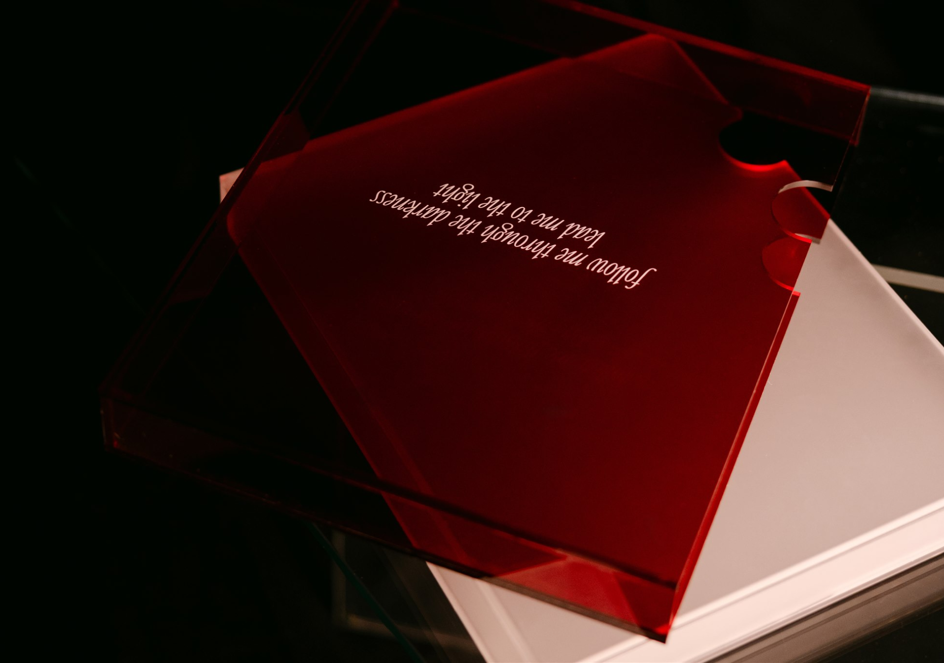
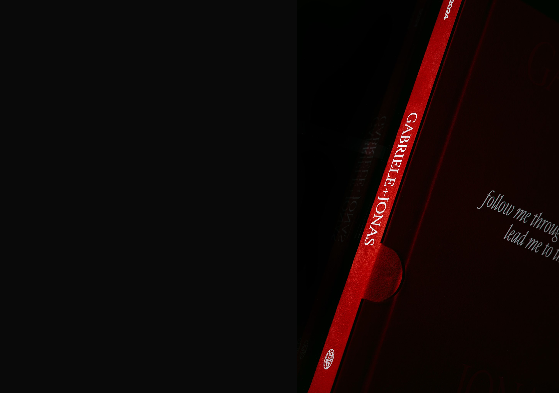
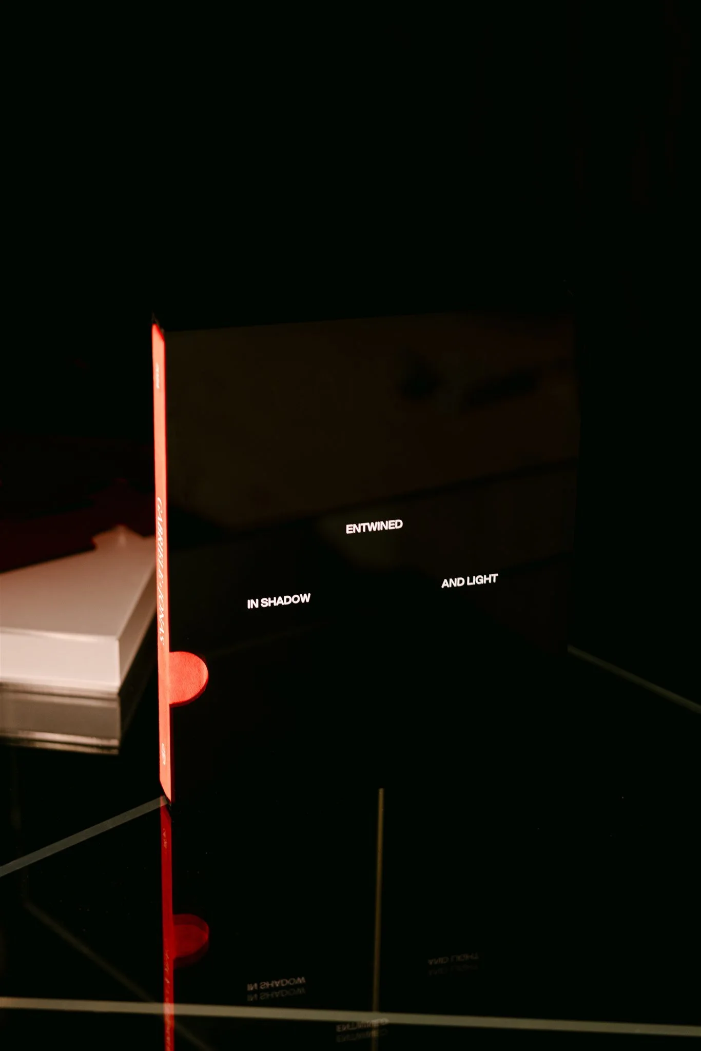
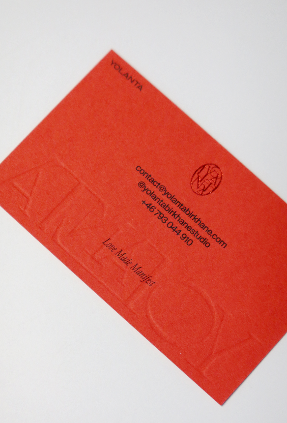
Yolanta Birkhane
Creative
Art Direction, Identity, Website Strategy, Website Design, Website Development, Print, Packaging
2024—2026
We worked with Sweden-based creative, Yolanta Birkhane, on developing a strong and expandable identity system for her wedding photography business. One thing Yolanta mentioned to us at the beginning of this process was that she wanted to showcase her true self with this rebrand: two sides of one coin with dark and light, moody and vibrant, serious and fun.
We explored different art directions, ultimately landing on an edgy and editorial-inspired logo system and type hierarchy as the basis for the identity. Blended with a bold and vibrant colour palette of black, red, and beige, mixed with blue, green, and yellow, the true icing on the cake was a series of 3D chrome and foiled accents weaved into digital and printed materials. Yolanta’s identity has since expanded into a stunning suite of packaging and custom wedding albums exclusively for her clients.
Illustration: David Snowdon
Portfolio Photography: Yolanta Birkhane
Info
6
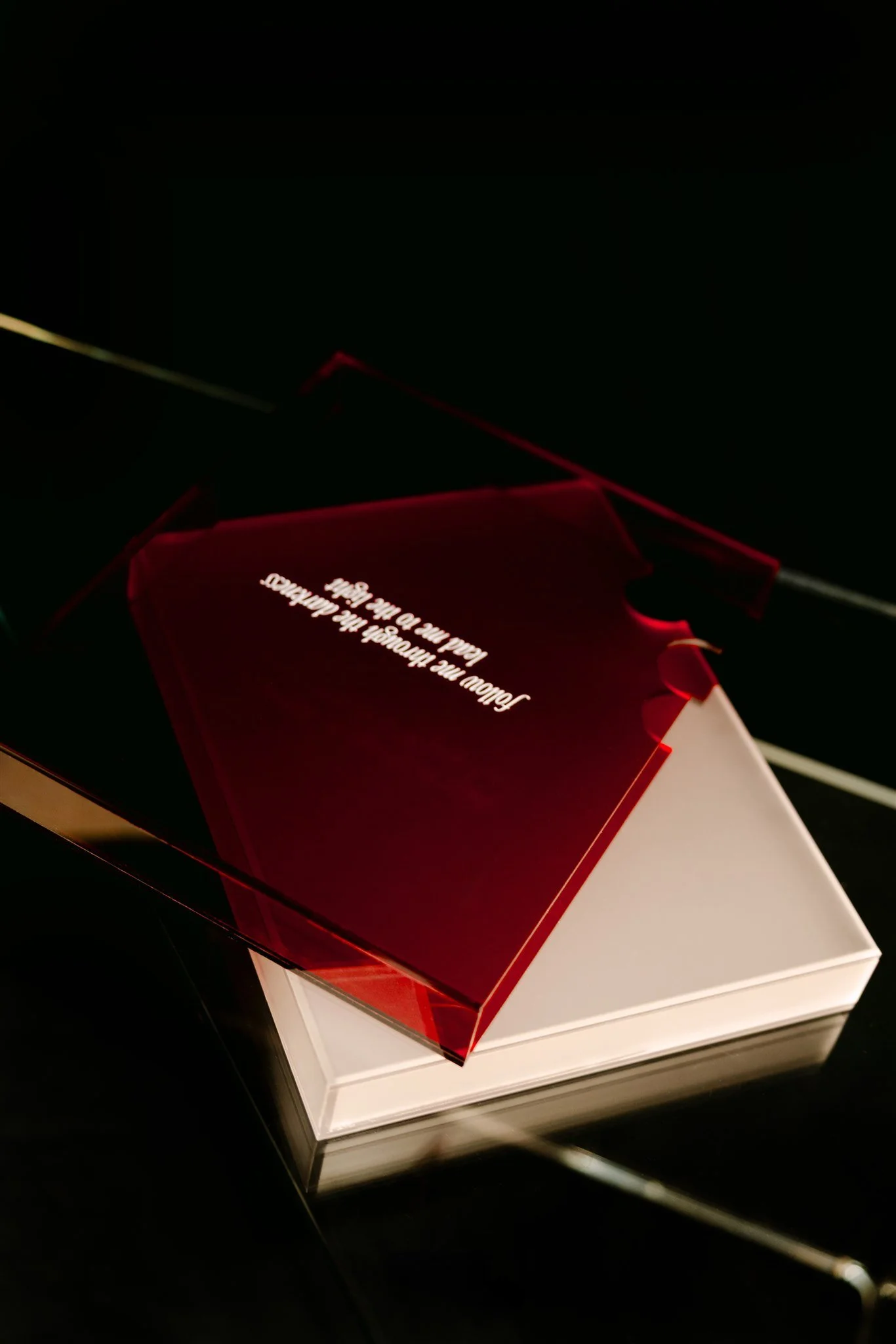
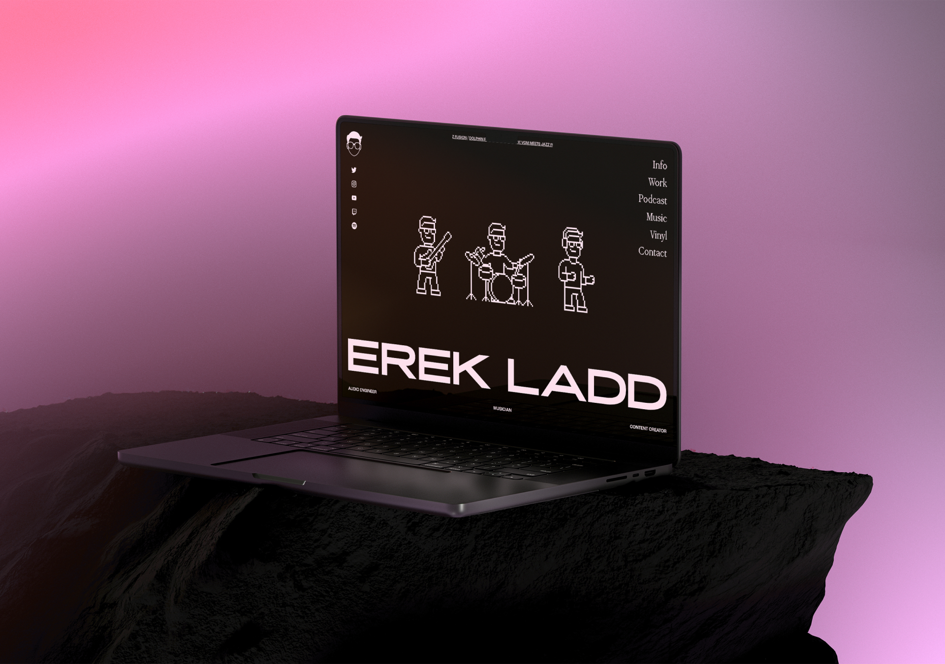
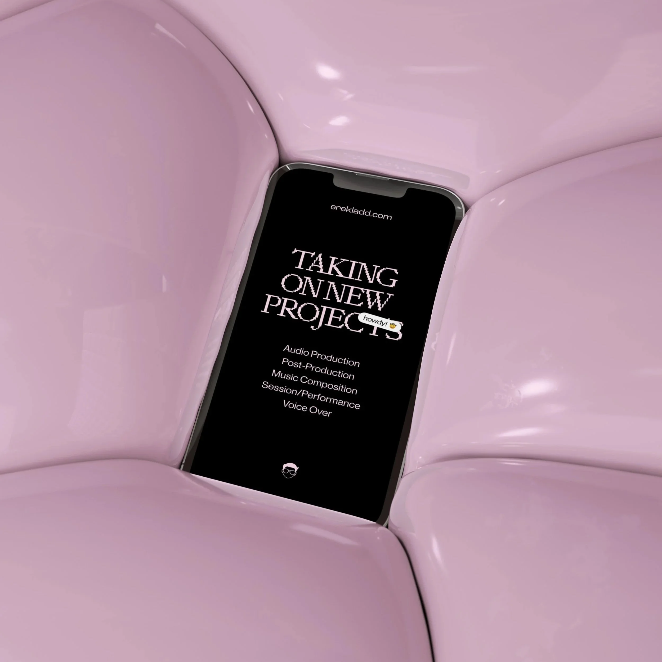
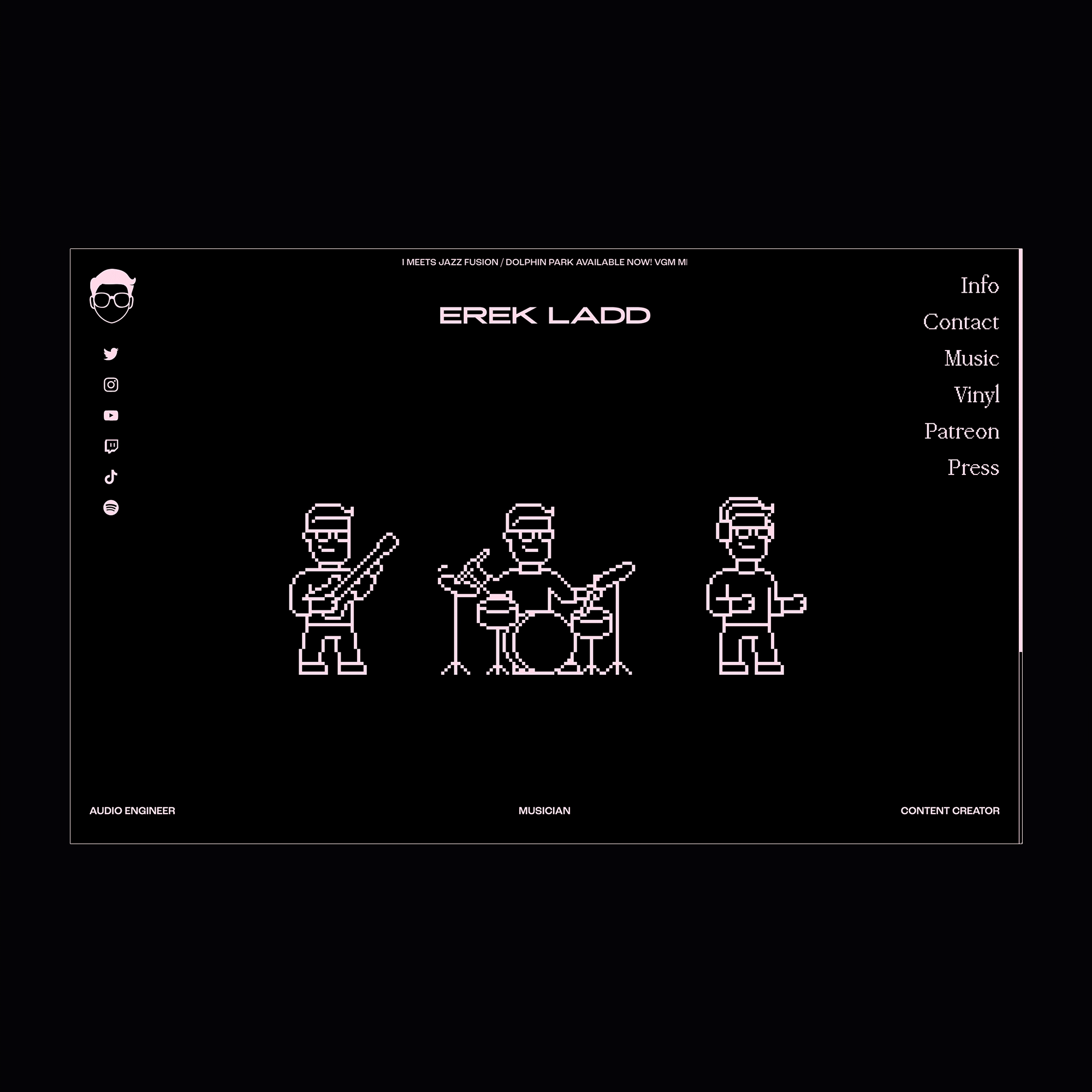
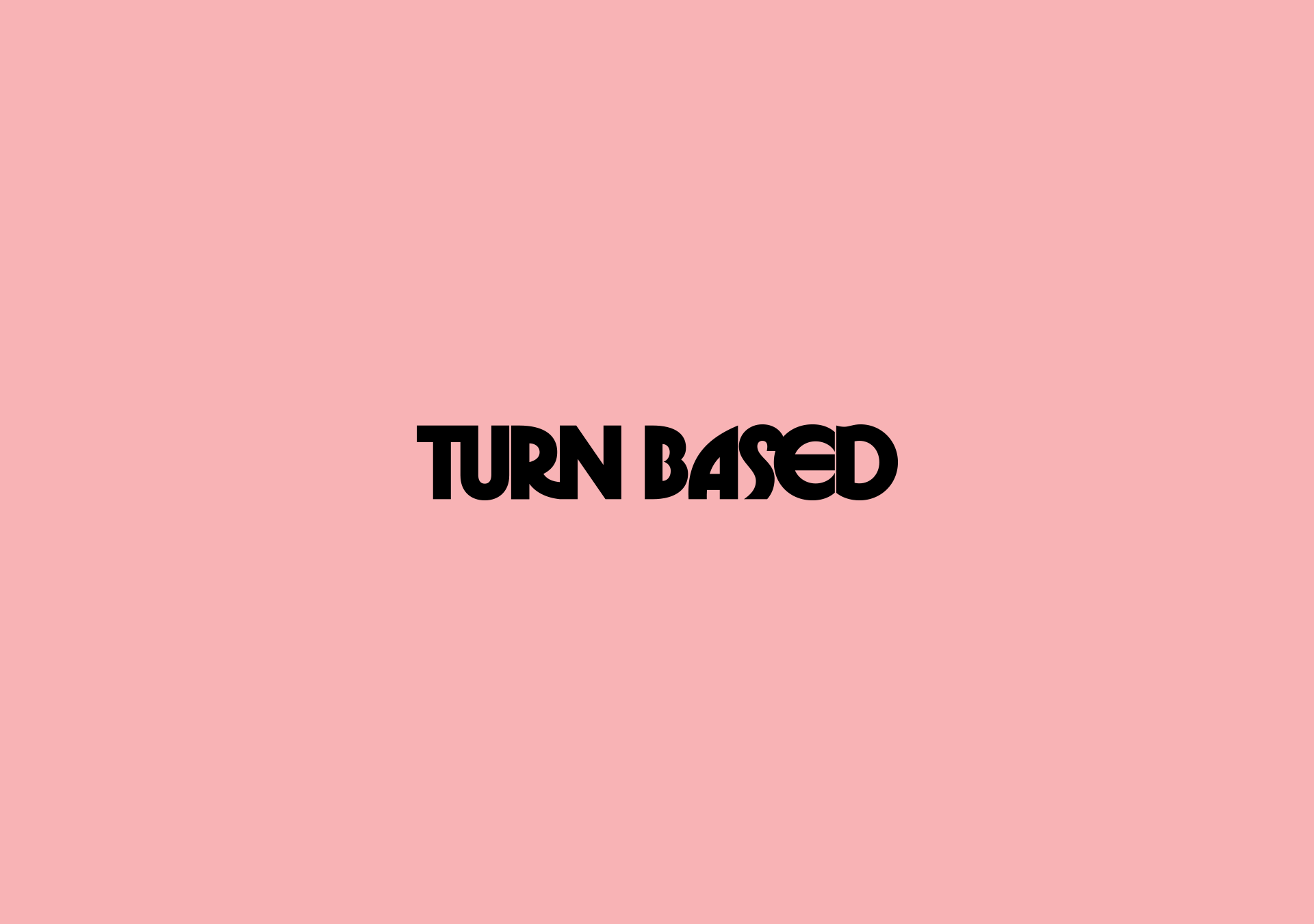
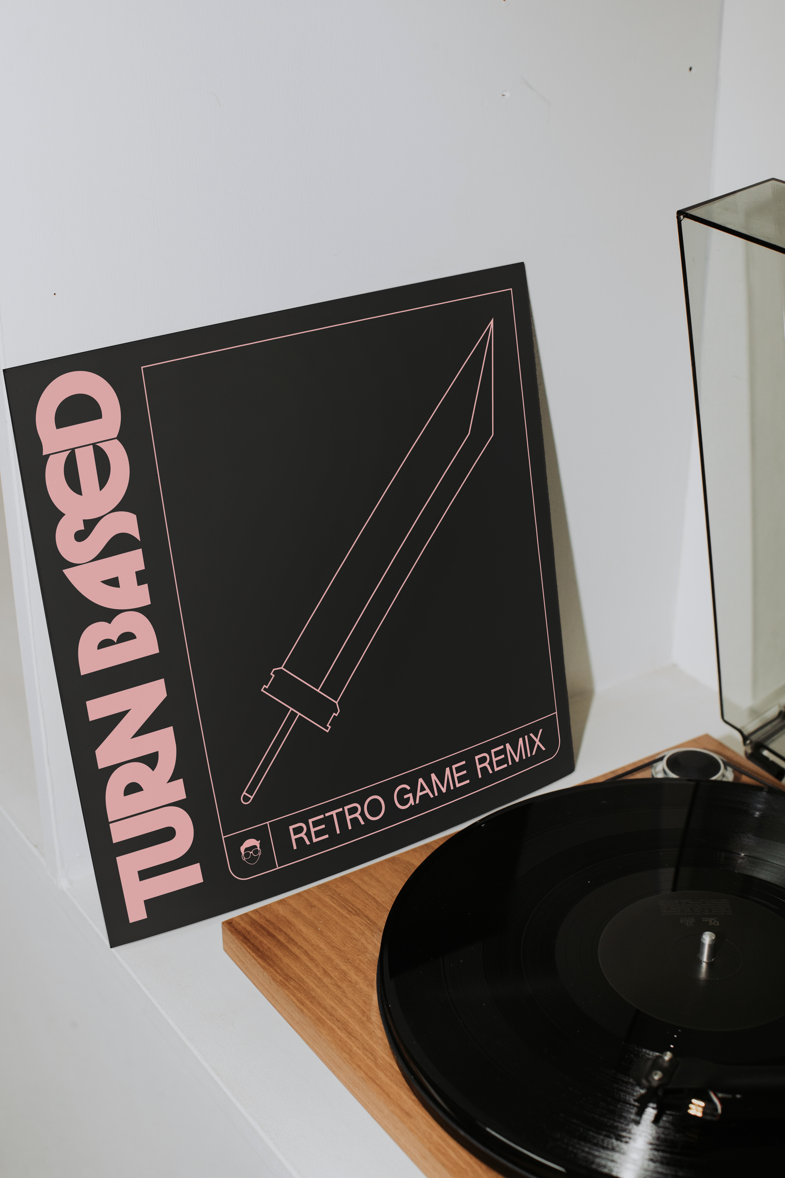
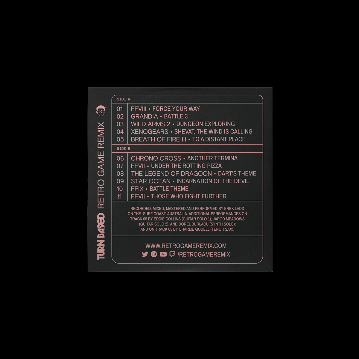
Erek Ladd
Creative, Music
Art Direction, Identity, Website Design, Website Development, Print, Merch
2022
We have worked with multi-hyphenate creative and slashie, Erek Ladd, since 2020. As an audio engineer, musician, and content creator, Erek wears many hats. Our greatest challenge was establishing the foundation of the identity so that it could keep all of his work under one umbrella, as well as grow and evolve through future seasons. We determined there was a common thread weaving each arm of his brand together, which was a primarily gaming-based audience in each. From this information, we determined the best strategy was to develop a personal brand with a cleverly executed art direction.
The overall parent identity was designed with exactly this in mind: picking and choosing the best of an 8-bit art style, minimalist grid layouts, and an 80s synthwave colour palette, all while throwing our own spin on it. Despite pursuing various passions and skills, sometimes giving more focus to one than another, Erek’s brand identity has continued to support him and remain flexible since it’s inception.
Info
7
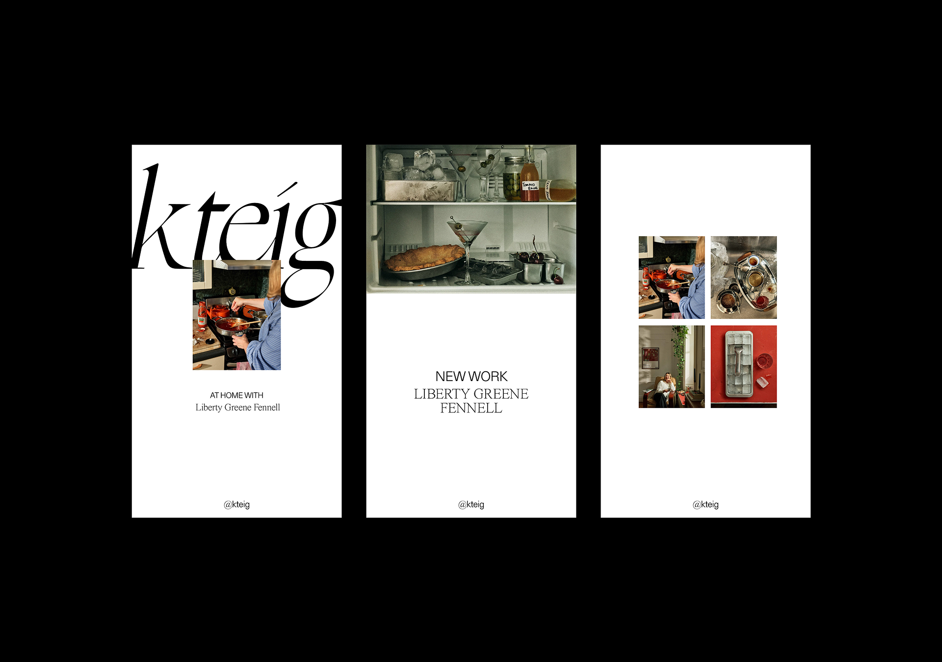
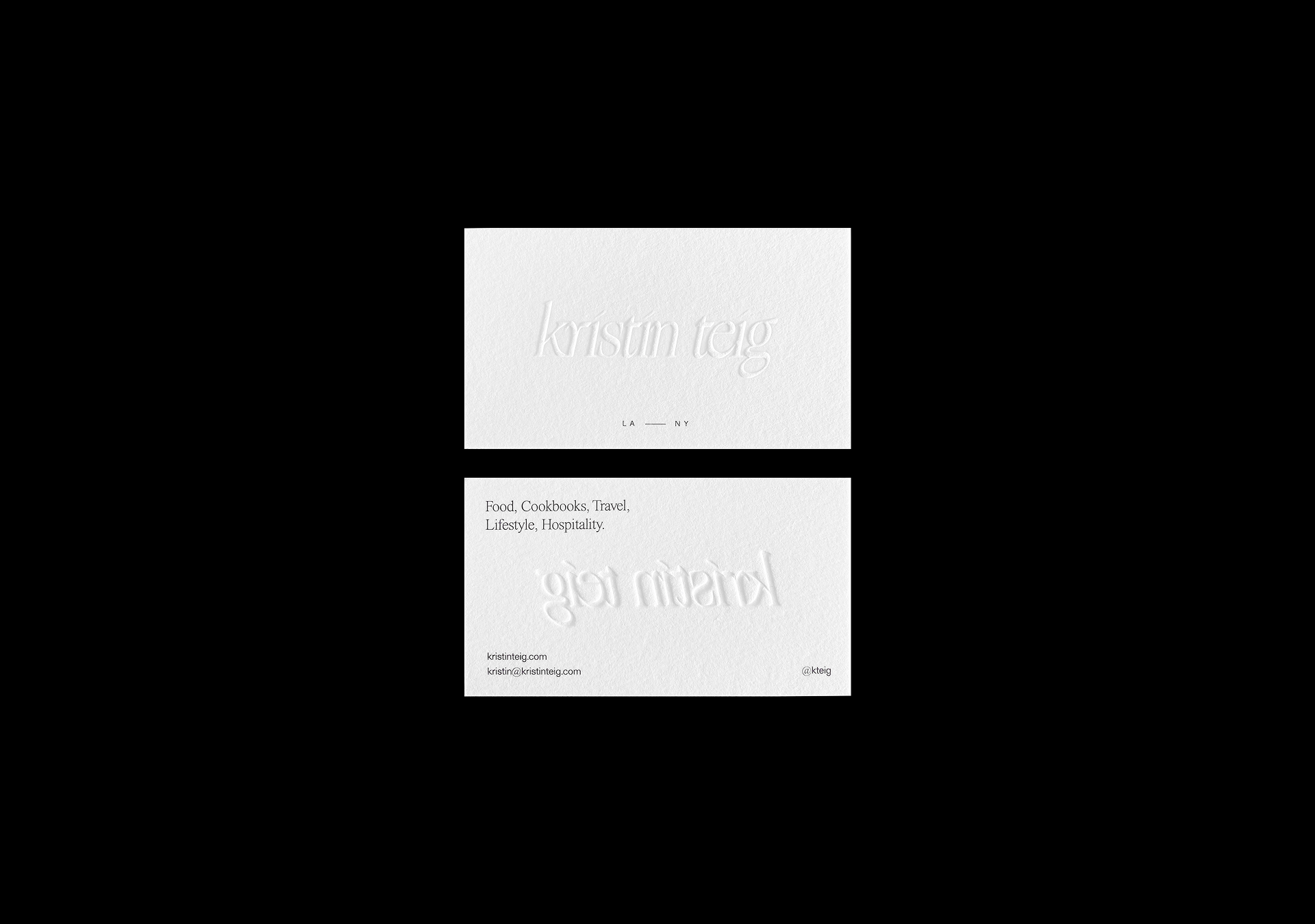
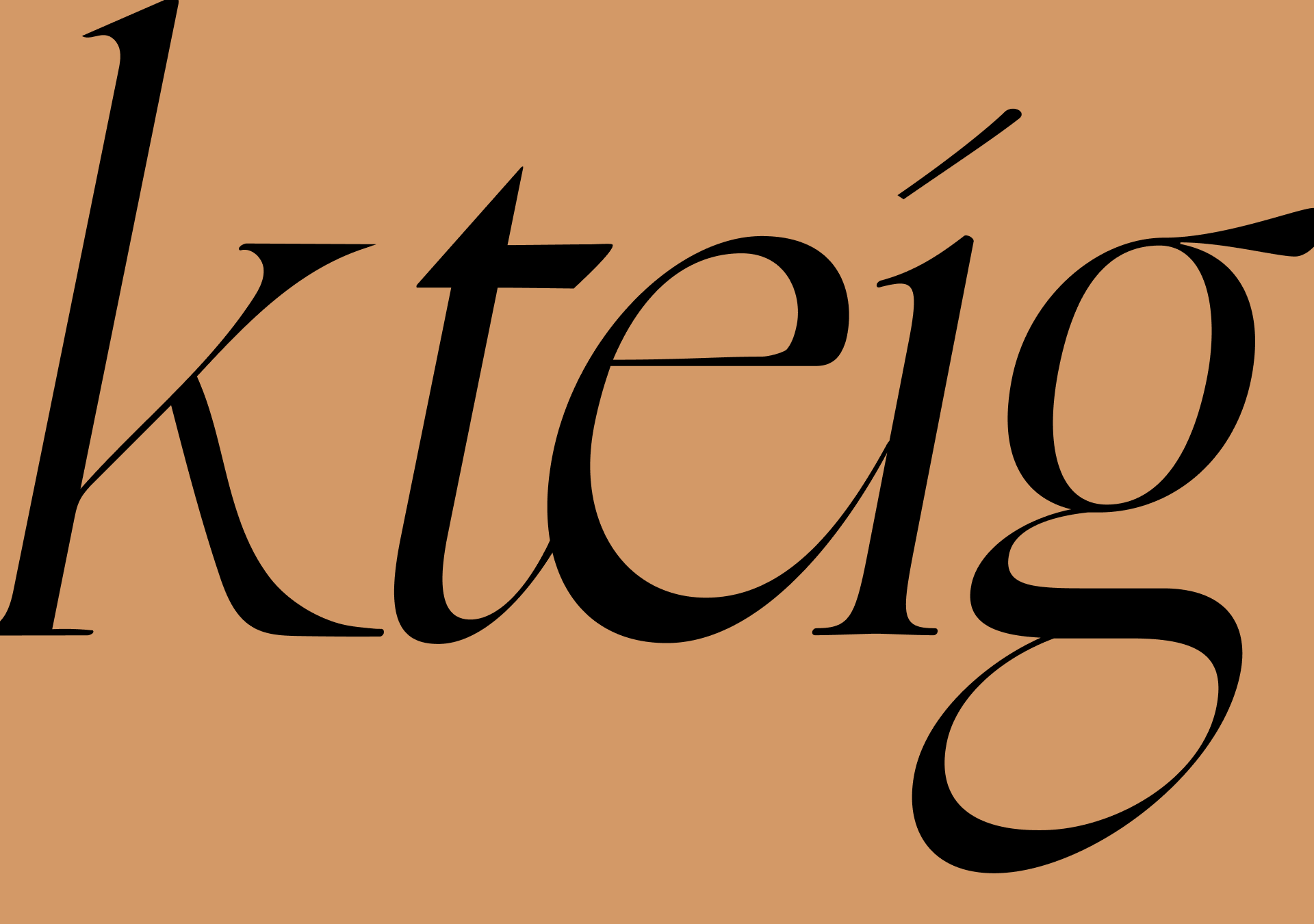
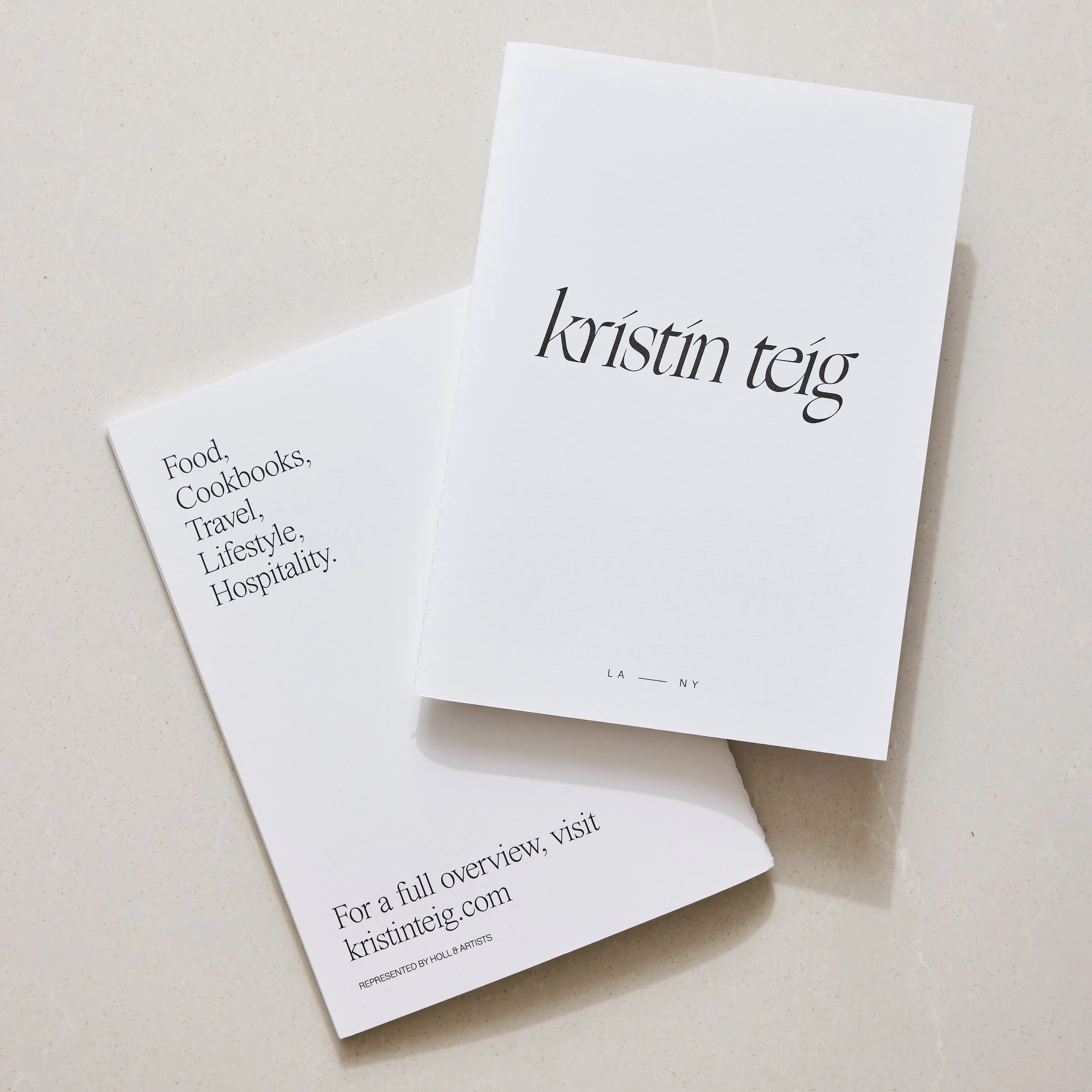
Kristin Teig
Creative
Art Direction, Identity, Website Design, Website Development, Print
2022
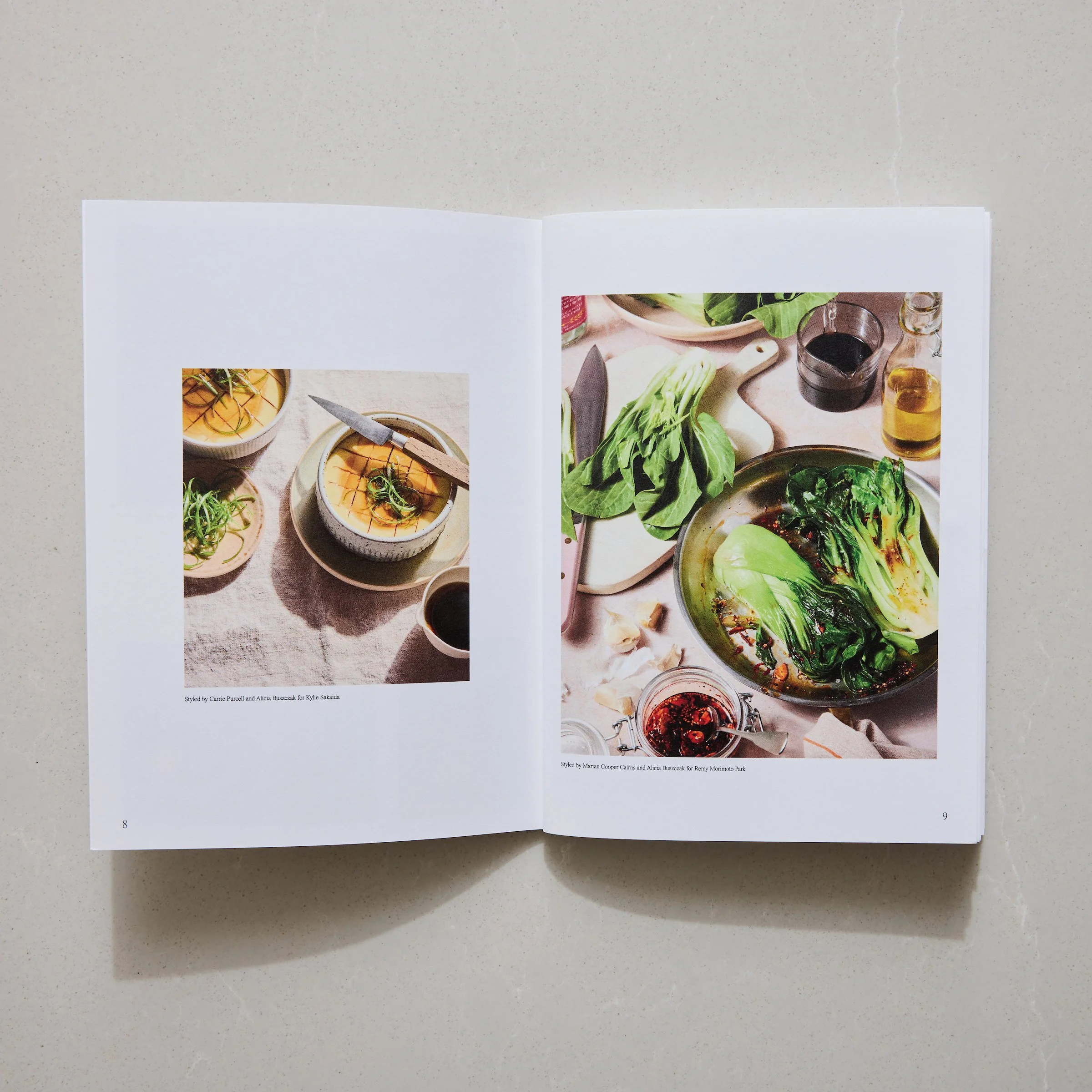
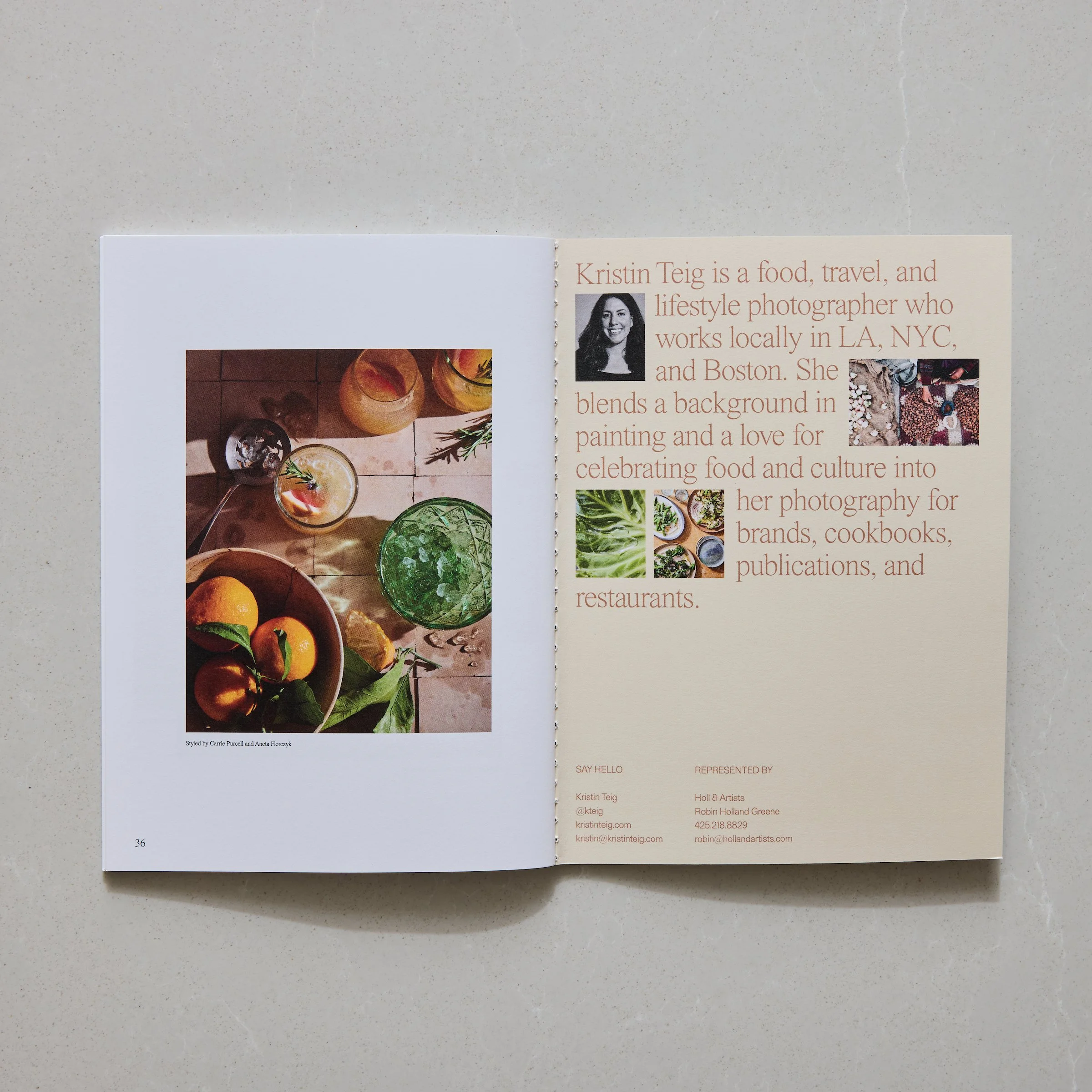
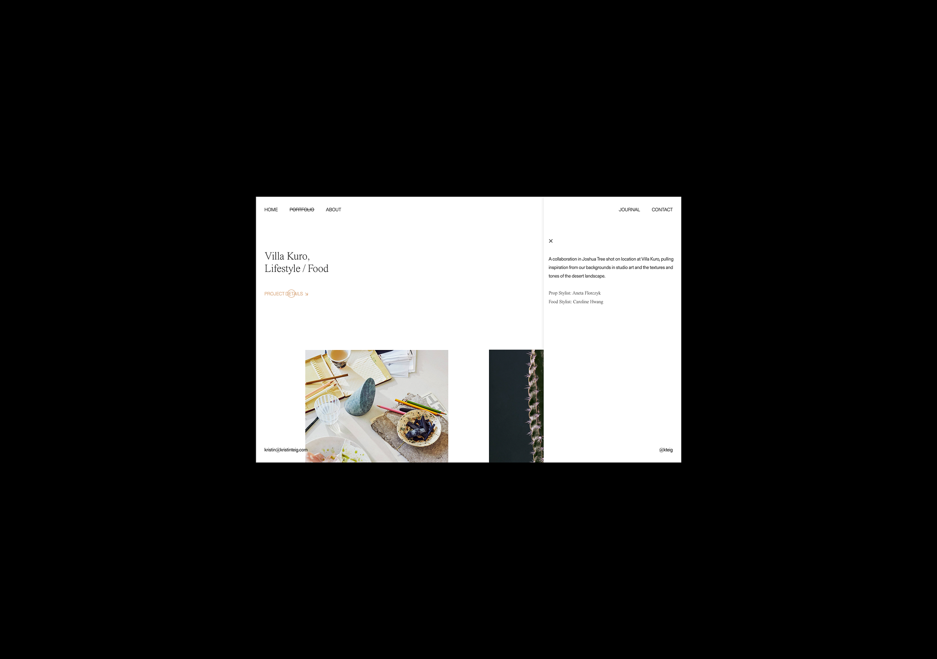
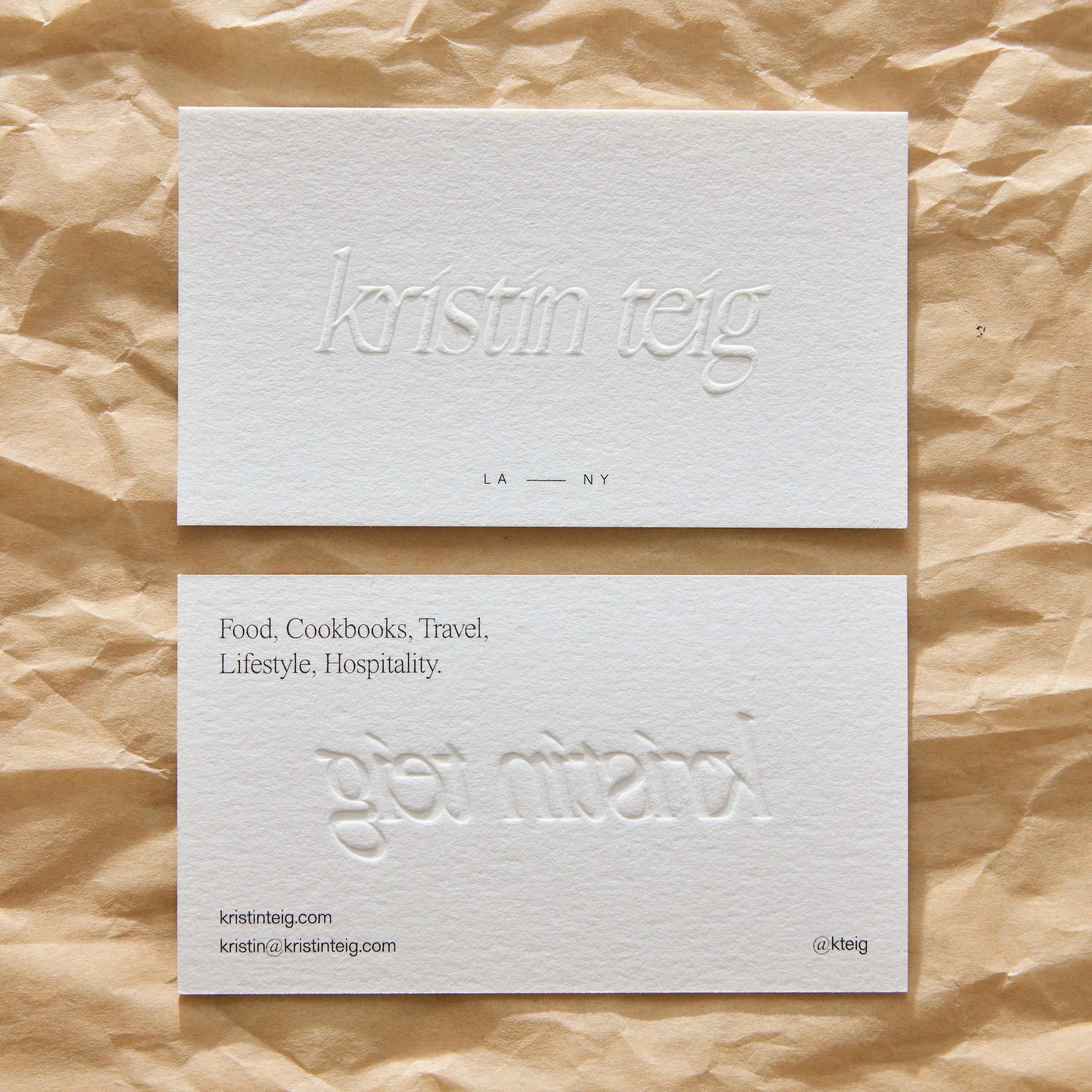
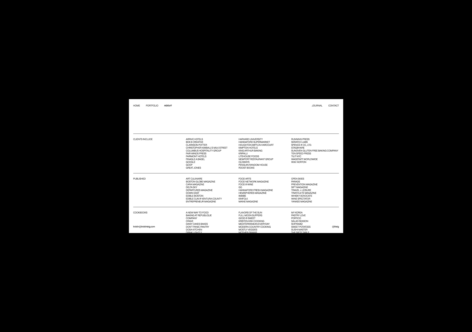
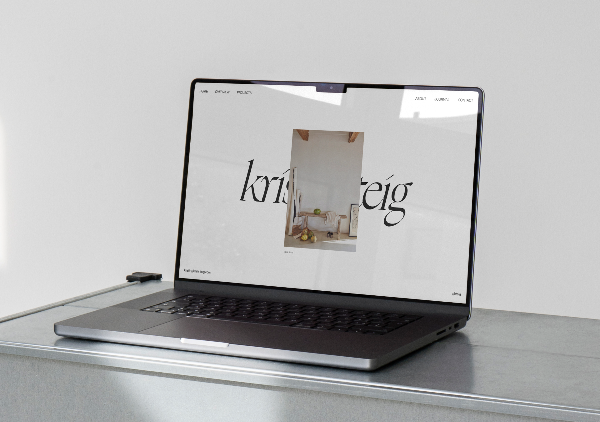
Kristin Teig is an established editorial and commercial photographer working between LA and the east coast. After almost two decades in her field, she came to us with the vision to finally create a brand identity and website design that represented her experience and skill. We approached the identity in a way that was clean and easy-to-navigate, taking overall inspiration from editorial matter to help guide the website and collateral.
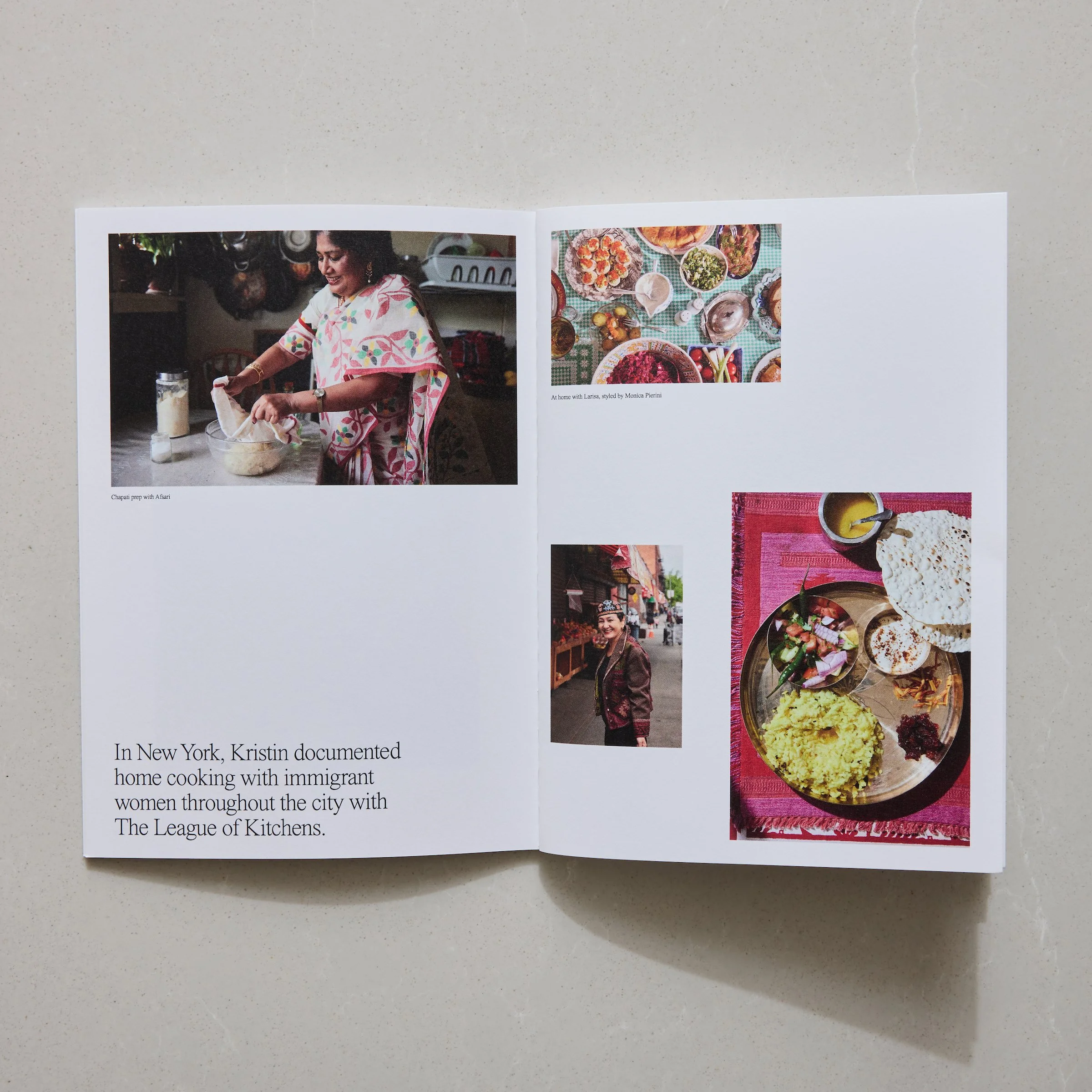
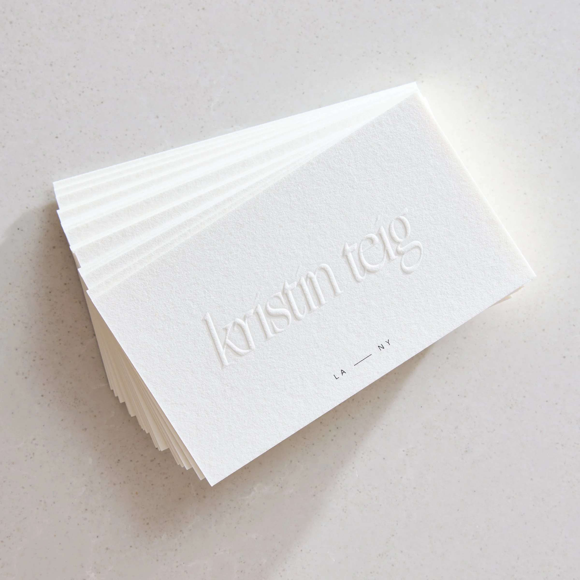
Our intention with this project was to have Kristin’s portfolio of imagery shine first and foremost, with the identity being crafted in a way that would support more so than overshadow. We achieved this by keeping simplicity at the core in each interaction — with a monochromatic and muted colour palette, a maximum of two type styles, and a strict grid-based layout with minimal functionality on the website. This extended further into the tangible assets and printed material, with a subtle blind emboss logo on the business card coupled with white cotton stock and black typography details, and a stunning printed portfolio mailer to share with future creative collaborators.
Portfolio Photography: Kristin Teig
Info
At Read Only, we acknowledge that we live, work and create on the land of the Wadawurrung people. We offer our respect to Elders past and present as custodians of their history, culture and country.